Krick zones
Most of you already know that I spent most of 2013 working as a bike messenger at Krick in Genève. One of my main fears when I started – and I mentioned it to PHK, the owner – was that I wouldn’t know the street names well enough. But that was a problem that could easily be solved: just learn them. From day one, I wrote down on a spreadsheet every company’s address where I picked something up or dropped a delivery. I would then spend the 20 minutes during breakfast mapping the most recent entries to the list to my mental map of Genève. That list had the other advantage that if the dispatcher didn’t give me a complete address, I could just look it up on the spreadsheet on my iPhone. This rarely happened, but it’s always good to have a plan B. I’m pretty sure this is more than any of my messenger buddies ever did, but that’s just how I function. Over the course of 10 months, my list of addresses grew to a whopping 990 entries.
Zones?
At Krick, a default city center delivery with no overweight costs CHF 16. For each additional kilometer, CHF 5 are added to the fare. After a couple of weeks, I had the feeling that this rule was enforced a bit loosely by PHK. So I augmented my list of addresses with the data needed to check how the rule was applied in reality. This is what I call the Krick zones.
The map
I love infographics. I figured, why not try to visualize these zones on a map? I created a first version a year ago as a greyscale map with colored dots. Each dot would be a client’s address, whereas each color represented a different fare zone. I ordered an A3 copy of the map at a printshop to hang it at the Krick office. I wanted to go a little step further and really visualize the zones themselves. I remembered Voronoi diagrams from school and during a couple of evenings last week, I built the following map:
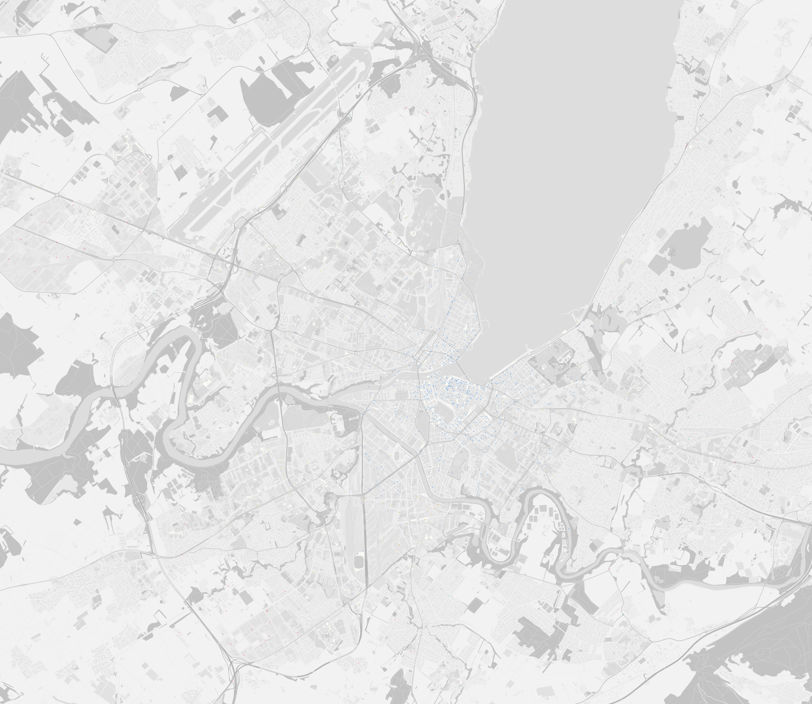

You can play with a slightly bigger version over here.
You can see that:
- there is some obviously wrong data, for example the orange zones inside the blue city center. These are probably errors on my part, when I entered the addresses into the spreadsheet.
- there is some missing fare data, represented by white zones
- there are some addresses that were misplaced by the method I used to translate addresses into latitude-longitude coordinates (read below). This results for example in that single blue zone to the east of the map
- the feeling I had about how the fare zones are wrongly applied was right. Please have a look at the next diagram.
I tried to manually – and somewhat coarsely – adjust the zones of the map and drew some circles to see if the zones grew regularly with each kilometer. They obviously don’t, because the circles are neither concentric, nor evenly spaced.

Let’s get technical
Like I wrote above, I collected the addresses of Krick’s clients every day and entered them in a spreadsheet. Using a nifty little tool, I converted the street addresses from the spreadsheet to latitude-longitude coordinates. Then I followed this very complete quickstart to install TileMill. Note that in the guide, they suggest two ways of installing a PostgreSQL database. I chose the more easy Postgres.app, not PostgreSQL/PostGIS with homebrew or from KyngChaos. I then downloaded the Switzerland dataset from here or maybe here. I honestly don’t remember, I did all this one year ago.
TileMill is a tool to create maps. It has a nice styling language similar to CSS. OpenStreetMap (OSM) is like Google Maps or Apple Maps, but with open data where basically anyone can contribute. OSM Bright is more or less the glue between OSM data and TileMill – as far as I understand. Postgres.app is a PostgreSQL/PostGIS combo, basically the database where the geographic data used by TileMill is stored. Finally, osm2pgsql, like its name suggests, magically converts OSM data to PostgreSQL data.
When I tried to launch TileMill last week to start working on the Voronoi diagram, nothing wasn’t working anymore. It seems that TileMill is broken on OSX Yosemite. The workaround is to run it on the nodejs server directly, like this: install Brew if you don’t have it, then in the terminal:
brew update
brew install mapnik node git protobuf pkgconfig
git clone https://github.com/mapbox/tilemill.git
cd tilemill
npm install
./index.js
You might need to sudo some of those commands. Finally go to http://localhost:20009/ in your browser to use TileMill.
In TileMill, I created a new project and used all the default styling for the map, but just changed the colors to greyscale to make the colored zone dots stand out a bit more:
…
@land:              greyscale(#FCFBE7);
@water:             greyscale(#C4DFF6);
@grass:             greyscale(#E6F2C1);
…
Then I gave each zone a color:
…
#zones {
  [zone = 0] { marker-fill: #288DF6; marker-line-color:#288DF6; }
  [zone = 1] { marker-fill: #EDA321; marker-line-color:#EDA321; }
  [zone = 2] { marker-fill: #D2EA32; marker-line-color:#D2EA32; }
  [zone = 3] { marker-fill: #23D36D; marker-line-color:#23D36D; }
  [zone = 4] { marker-fill: #F62B19; marker-line-color:#F62B19; }

  [zone = 5] { marker-fill: #288DF6; marker-line-color:#288DF6; }
  [zone = 6] { marker-fill: #EDA321; marker-line-color:#EDA321; }
  [zone = 7] { marker-fill: #D2EA32; marker-line-color:#D2EA32; }
  [zone = 8] { marker-fill: #23D36D; marker-line-color:#23D36D; }
  [zone = 9] { marker-fill: #F62B19; marker-line-color:#F62B19; }
}
…
I repeated the colors because I couldn’t find more than 5 really distinct colors and I was too lazy to dive into color theory.
That’s it for the map. Quite easy actually.
Things got a little hairier when I tried to figure out how to do the Voronoi diagrams. I quickly realized I should use D3. I struggled a bit with map projections, various json formats, SVG paths, SVG basics, D3 geo paths etc. In short, I went through a lot of trial and error, and still haven’t figured out map projections. But anyway, you can have a look at the code on my GitHub. And BTW speaking of GitHub, they have a feature to automatically preview geojson files, and here’s that feature applied to the Krick data.
A little aside about printing
I mentioned before that I printed a copy of the map to pin it to the wall at the Krick office. I needed some infos about image and printing resolution, as well as paper quality. My Facebook friends came to my rescue:
Manu: Est-ce qqun arrive à me dire quelle taille en pixels une image (png) doit faire pour être imprimée en A2? En sachant que je suis fixé à 72dpi.
Manu: Est-ce que ça dépend de la résolution de l’imprimante? Par exemple si elle fait du 300dpi et sachant que le A2 est du 23.4 x 16.5", il faut du 7020 x 4950 pixels? Mais puisque mon image est en 72dpi, il faut qu’elle ait 4x le compte en pixels? Donc 29000 x 20000? Ça fait une grosse image…
Manu: Est-ce que le “dots” dans dpi est synonyme de pixels?
Mich: les journaux imprime en 75dpi, les magasins en 150dpi normalement. mais pour ta réponse, voila: www.format-papier-a0-a1-a2-a3-a4-a5.fr
Yoann: Toutes les impressions se font en 150dpi de base. En dessous c’est un peu la merdouille. Moins de pixels, plus de pixels… Si tu vois ce que j’veux dire
Manu: ouais c’est bien ce que j’ai cru comprendre. Mon fichier de base est obligatoirement en 72dpi, mais je peux spécifier la taille de l’image au moment de l’exportation
Max: La résolution pour impression sur papier c’est 300dpi! (entre 250 et 300dpi) en dessous c’est pas top comme qualité. 72 c’est vraiment que pour le web. Après quand tu as une image que tu veux imprimer et donc passer en 300dpi, il faut que de base elle ait une dimensions de pixels déjà importante car on ne touche pas au pixel au passage à 300dpi sinon on augmente le nombre de pixels mais qui seront des faux pixel créés à partir des autres et n’influencera en rien sur la qualité finale et au contraire fera que tu as une image très lourde, plusieurs Go. Donc quand tu vas passer ton image en 300dpi dans toshop dans “Taille image” attention que la case “Rééchantillonage” ne soit pas cochée. Par contre quand tu passes en 300dpi tu perds en dimensions. Ce qui est logique si on veut garder le même nombres de pixels. Par exemple, une image qui fait 560x420 mm et 1600x1200 pixels en 72 dpi fera 135x100 mm en 300dpi et toujours la même taille de pixels comme expliqué avant. Donc il faut que ton image soit grande de base car pour arriver à un format d’image A2 en 300dpi sans perte de qualité il faut que ton image ait 4961 × 7016 pixels. Si ton image a été prise avec un reflex tu devrais avoir la qualité requise pour faire du A2.
Max: et pas oublier de mettre en CMJN !
Max: Les imprimantes ont 4 couleurs donc faut du CMYK, mais ce qui est expliqué, c’est que quand tu modifies ou travaille sur ton images (retouches) alors la oui tu reste en RGB et quand ta tout finis tu passe en CMYK
I’ll leave that here for future reference. See, sometimes Facebook can be useful.