Ups and downs
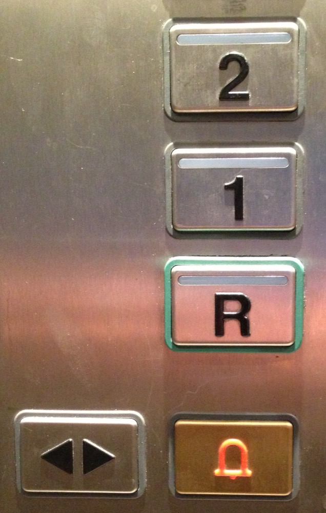
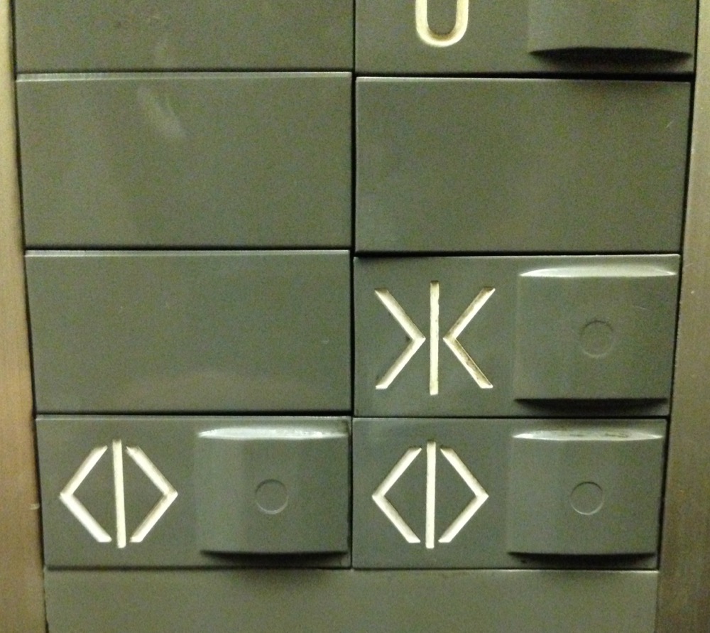
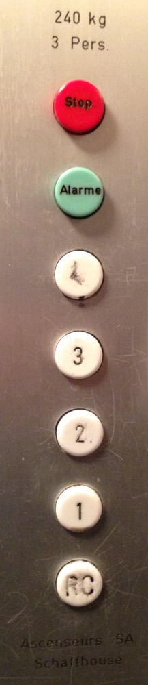
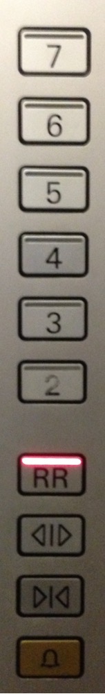
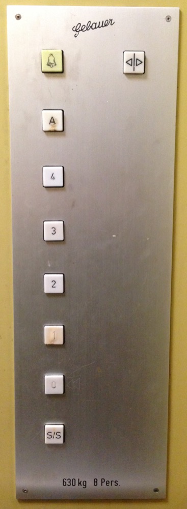
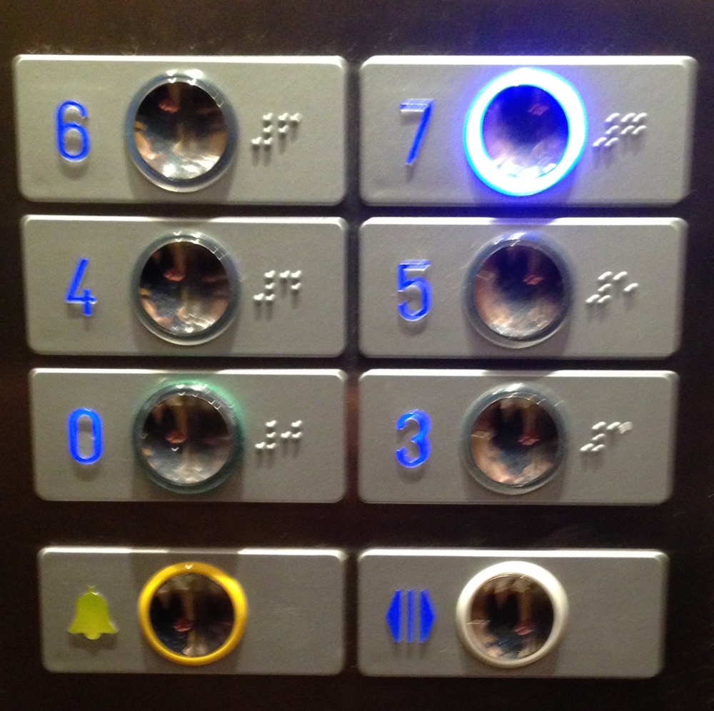
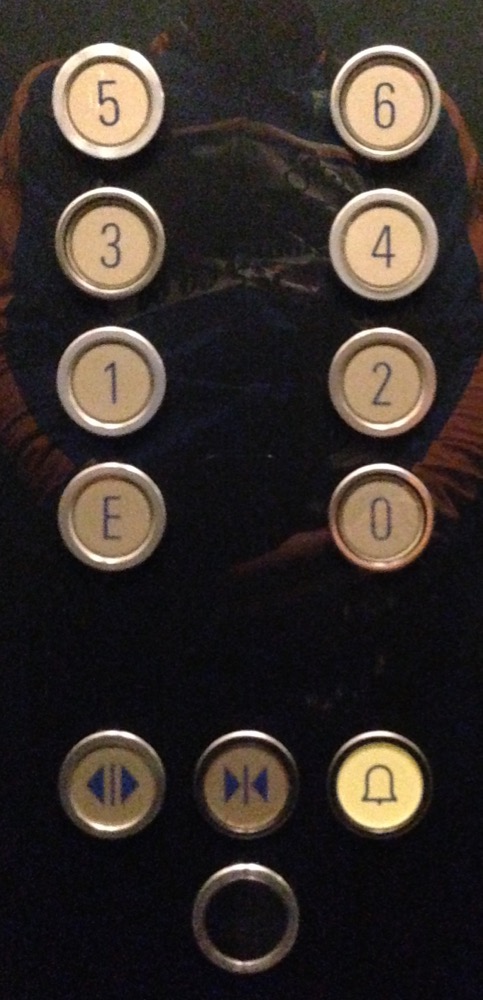
I’ve written about my awesome year as bike messenger twice in the past. This post makes it the third and likely last, and it’s even weirder than the previous ones. It all started with this elevator control panel:

As a messenger, you spend a substantial amount of time in elevators. Of course, in Genève or Lausanne, it’s nothing compared to New York for example, but enough to notice a number of things. The first couple of times I rode the pictured elevator, I thought to myself that the alarm button was very unfortunately placed where the close-door button should have been. I was wondering if at one point during a delivery I might push the alarm instead of the close-door button. Sure enough it happened. I then decided that I wanted to find out how many of these badly designed elevator panels were out there in Genève. So during my elevator rides, besides bagging and unbagging a delivery or a package, I started taking snapshots of all the different panels I could find. I’m a front-end engineer, so part of my job consists of thinking about the user interface and user experience aspect of software. People can be really picky and go crazy about small details on website or apps. It doesn’t however seem to be the case for elevators. Maybe their interaction is short enough not to bother. But when you’re a bike messenger, you ride a lot of elevators.
The panels
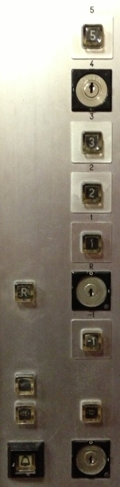
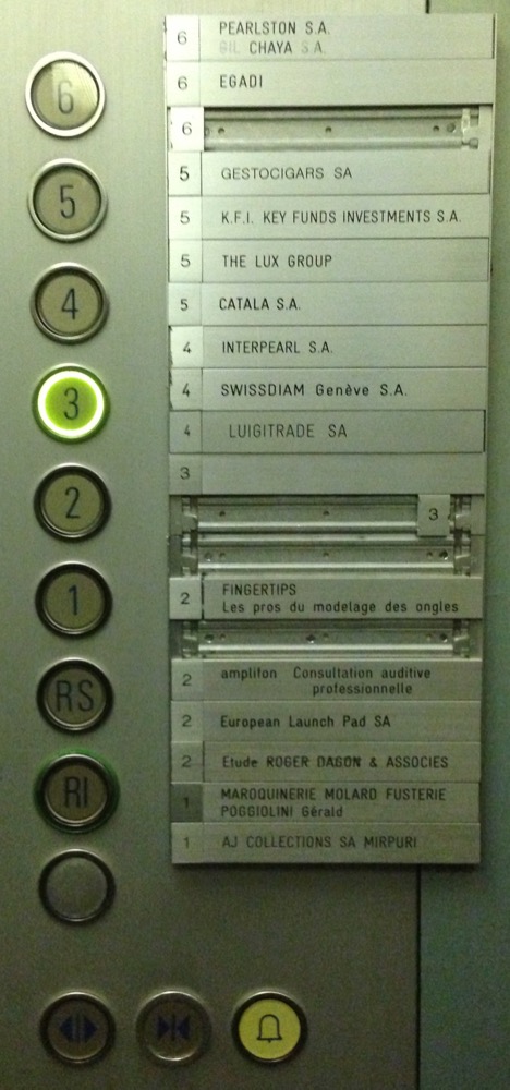
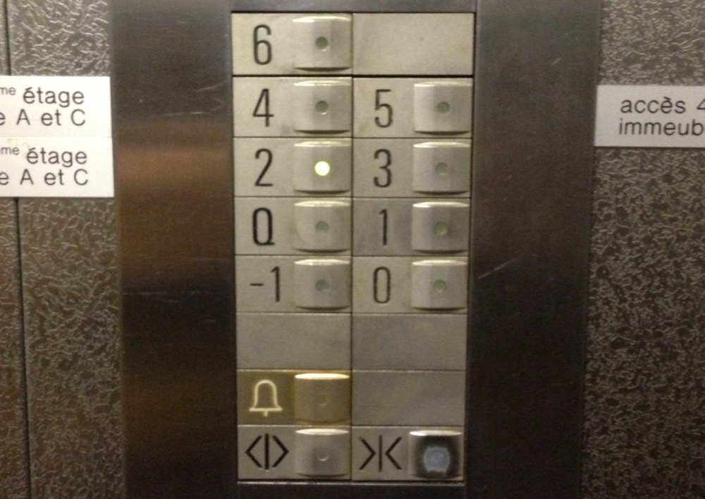
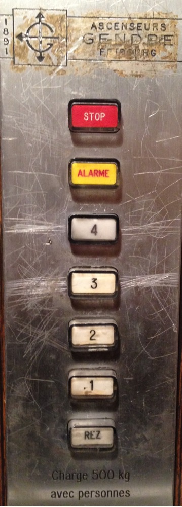
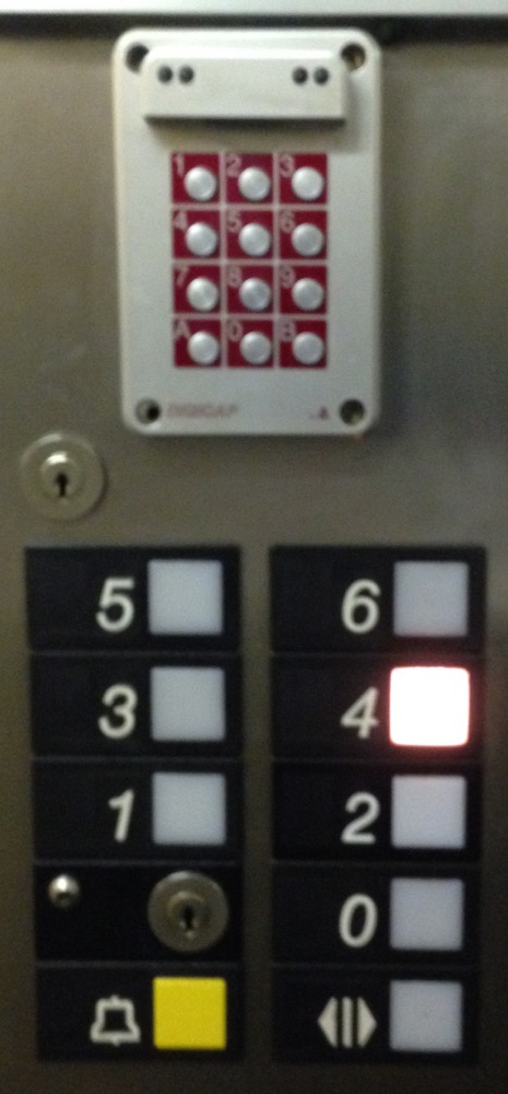
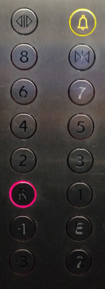
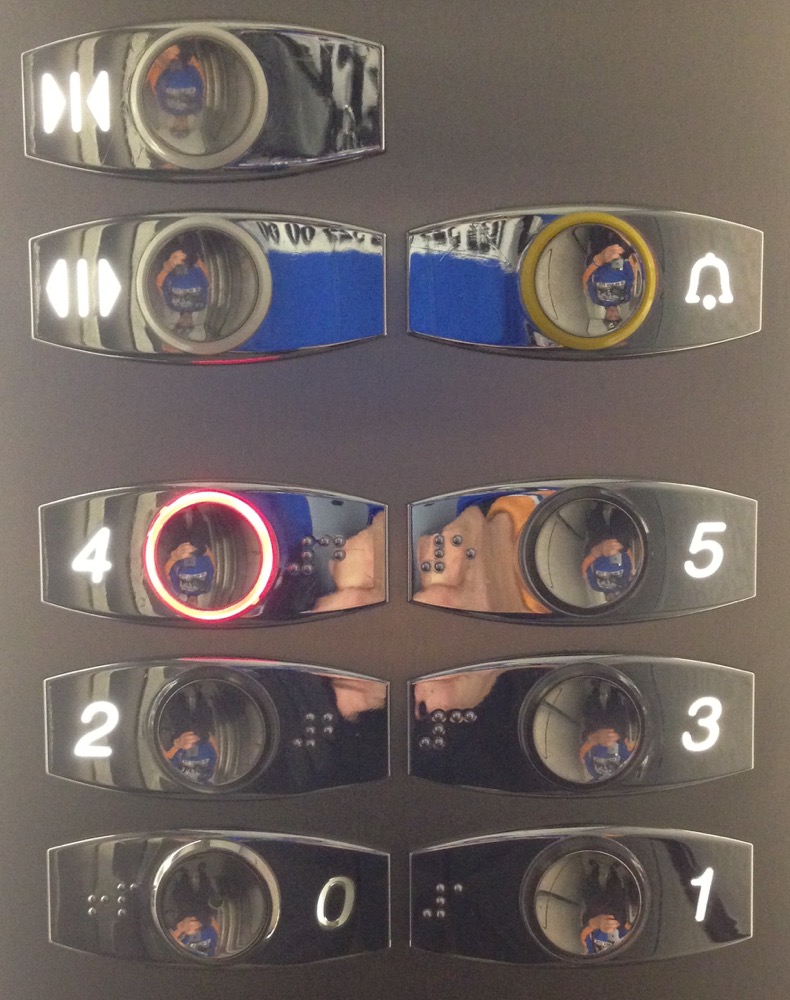
Some of the first pictures I took are missing parts of the elevator control panels, because at the beginning I was only focusing on the open-door, close-door and alarm button layouts. I then started shooting the whole panel. I encountered 175 different panels, which I abstracted below. The panels’ buttons follow this color scheme:
- and buttons
- button
- button
- , , , buttons
- , including buttons
- not a button per se, but a
This looks a bit like a city skyline:
Patterns
I did not write any algorithm that finds similarities. However, when you eye through the list you can notice some patterns. For example, the ones with and buttons stand out a bit, because there are very few of them:
They’re also really peculiar, because you basically have no choice for the floor. The single-column elevator panel layout with no open/close-door buttons, but with and buttons also stands out:
If you look at their pictures – you can click on the elevator figure – you’ll notice that most of them are fairly old elevators. They most likely don’t have open/close-door buttons, because their doors have hinges and cannot be automated like sliding doors. Then there’s the less obvious pattern of the // buttons combination in the following elevators:
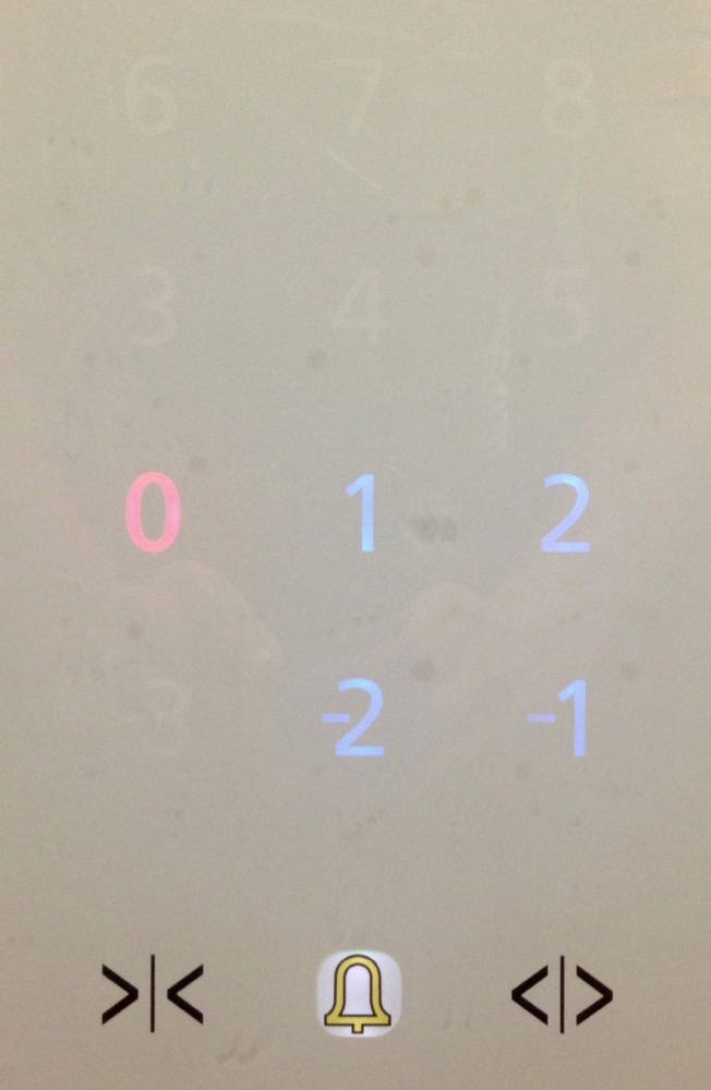
Some elevators have their floor selection buttons arranged in a zigzag:
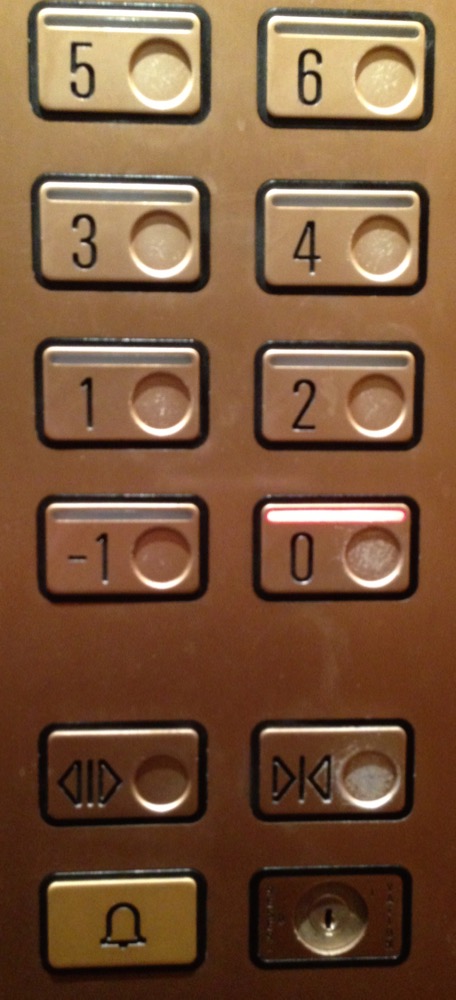
Most importantly, you can clearly see that more or less any possible combination of // buttons exists, which is exactly what I wanted to document. This lack of pattern is actually the biggest pattern. The button in the middle, but the or the button on either side:
The button on the left:
The button on the right:
The button surrounded by and buttons on both sides:
The button on top or below the and buttons:
Well, you get the idea.
Floor numbering
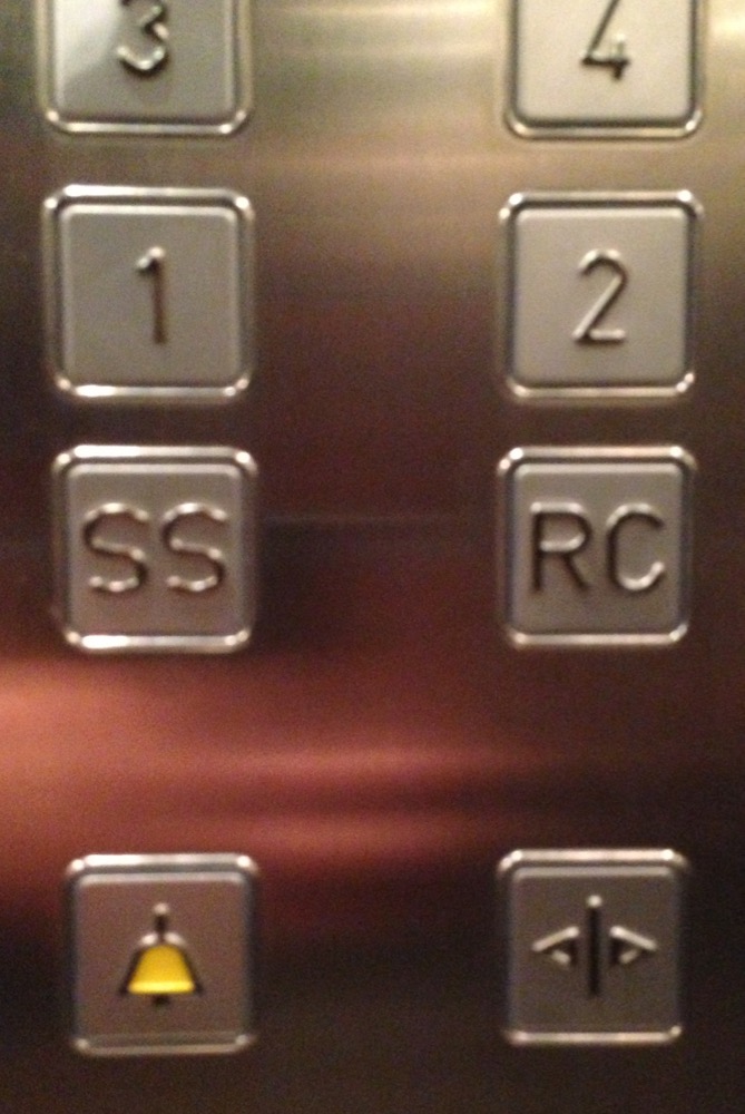
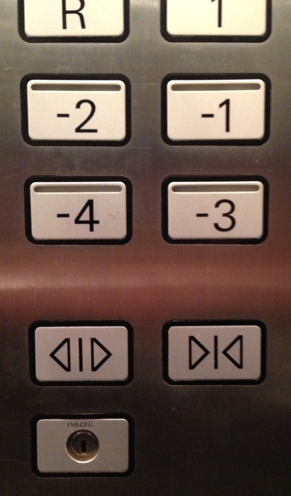
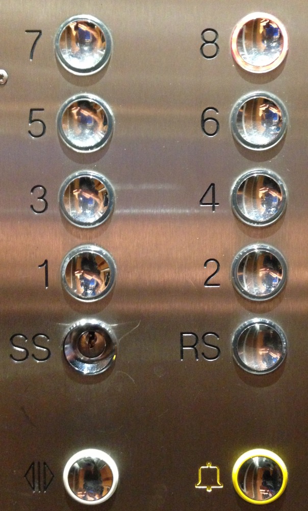
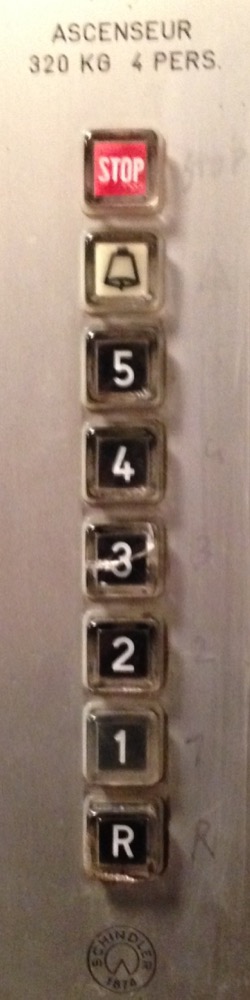
There’s obviously a Wikipedia section about the floor numbering in buildings. Countries like China for example sometimes ban the number 4 because it is homophonous to the Chinese word for “death”[1]. In Genève, I haven’t noticed any such weirdness. The ground floor usually is 0, R – for “Rez” – or RC – for “Rez-de-chaussée”. There seems to be a convention to mark the ground floor in green. Floors above the ground are simply numbered 1, 2, 3 etc. Floors below the ground are either numbered negatively like -1, -2, -3, named 1S, 2S, 3S or S1, S2, S3. If there is only 1 underground floor, it might be called SS, which stands for “sous-sol” – literally under ground. There are of course exceptions.
With a highest floor number of 18, Genève is definitely no Manhattan.
Some stats
The thing that started all this was the relative positioning of the and buttons. So here are some stats[2] about it:
You know how they say that usually those and buttons don’t do anything? That repeatedly pressing them just makes you feel like the time waiting for the doors to open or close passes faster? I did not have that impression. Most of the time, the buttons seemed functional and reactive. I would press once, and the door would move.
What are the pictograms used for the and the buttons?
What buttons do elevators have?
It looks almost as if the button is mandatory. Maybe the button as well, at least on recent elevators.
What type of buttons do elevators have?
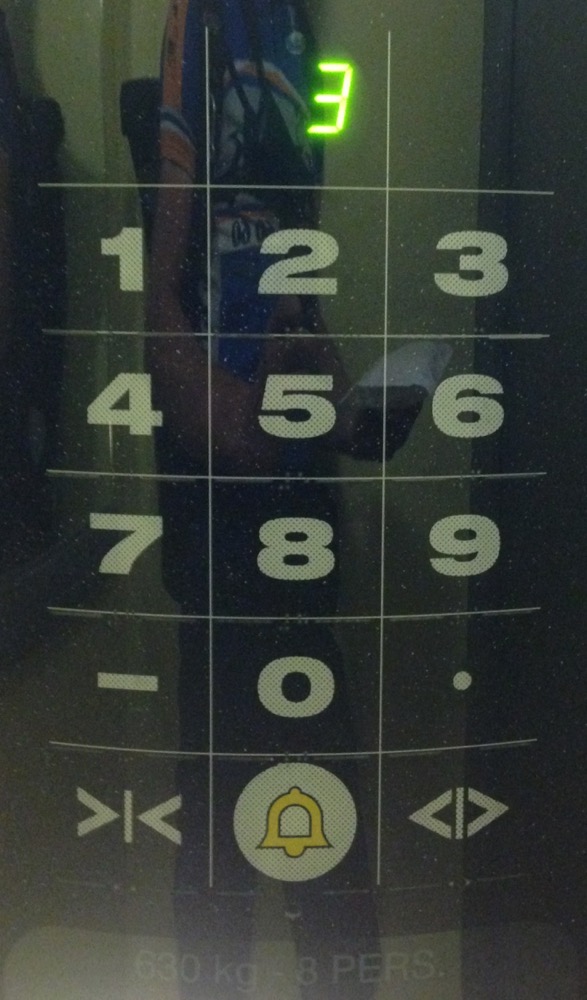
Touch panels are the worst. If you’re wearing gloves or if your hands are wet, they simply do not work.
What other kind of information is shown on elevators panels?
It may seem bad that only 14% of elevators have braille labels, but a lot of elevators probably don’t need them because the floor numbers are engraved, so you can more or less “read” them with your fingers. Or maybe that’s more like a coincidental support for blind folks than good intention.
With the information about weight limits, the acceptable average weight of a person can be calculated:
Of the 24 elevators that have an indication of a maximum of persons, here’s how the number of persons is distributed:
The same, but for the maximum allowed weight:
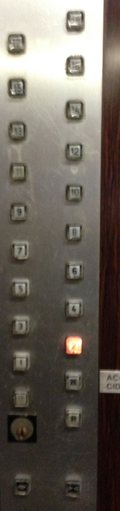
The distribution of the number of button columns looks like this:
So what is the most generic control panel?
If we take all elements marked with a in the previous section, we can build a generic control panel:
- 2 columns of buttons
- 2D buttons
- both an and a button, with arrows-only pictograms
- the and the button are next to each other, not on top of each other, and the button is left of the button
- an button
- the buttons for the floor selection have decreasing numbers if you read them from top to bottom and left to right
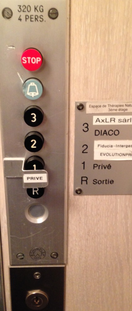
Furthermore, the elevator would probably fit 4 people weighting a total max of 320 kg.
More oddities
Here’s an unordered list of some more weird things about these 175 elevators. As you can see, there’s something remarkable about pretty much each one of them:
- 001: you cannot do anything. Actually I’m not sure anymore this was inside the elevator…
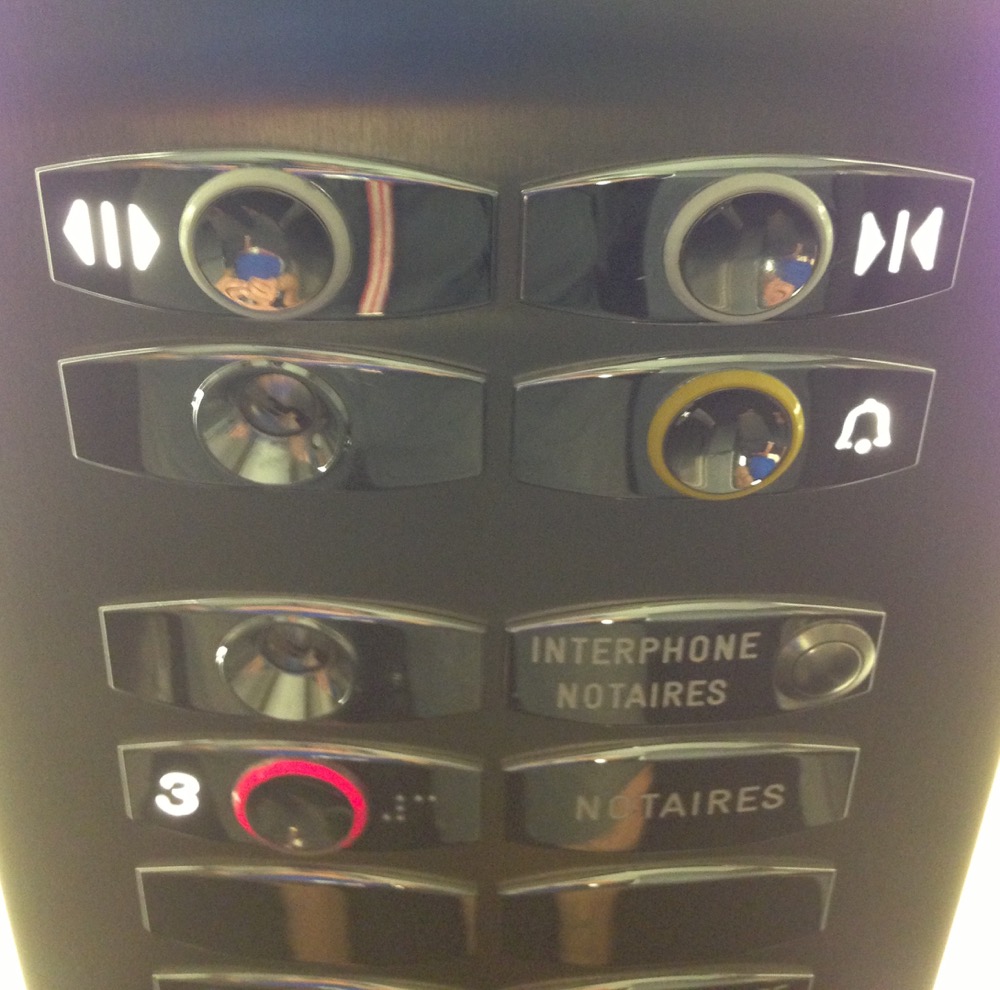
- 003: you get an interphone to the only selectable floor
- 013: the and the buttons have different pictogram types
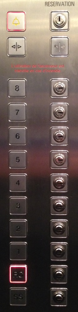
- 014: “RESERVATION”?
- 030: I appreciated those very obvious hints of which button I had to press
- 031: both a and an button, for those cases where you want to stop the elevator, without ringing the alarm. You know. Those cases.
- 032: “REZ INF” and “REZ SUP” happen when there are 2 ground floors, somehow
- 035: a control panel like a phone
- 037: fake buttons, because it supposedly looks nicer?
- 042: “R” and “R1”, I’m confused
- 045: a touch panel and no braille. This one’s the worst for blind people. It might have had audio feedback, but I don’t remember
- 054: less is more
- 057: “SS” and “RS” (“Rez Supérieur”), yet another unique combo
- 065: “R” and “E” (“Entrée” or “Entresol”?). So which one is the ground floor?
- 066: a 0, another 0 and an “R”. The two 0s can probably be explained by doors on each side of the elevator. But then why add an “R”?
- 070: the lookup table is too close to the buttons. My brain has to do too many mappings
- 074: this one’s a gem. Fake buttons that light up, real buttons that don’t. An interphone. And a mysterious fat keypad for entering the secret code to reach underground level -37
- 075: 0 and “E” for the ground floor. And you basically have the choice between nothing, and J.P.Morgan e-v-e-r-y-where. Which is dumb, because then the dispatcher can’t just tell you to go to J.P.Morgan, he has to specify the floor number as well. If he knows it, which is another problem
- 077: see 054
- 082: E is for ETAGE, M is for MEZZANINE. Makes sense. But then 0 is for SORTIE and -1 is for 1er S.SOL. No consistency whatsoever
- 085: similar problem as 065
- 086: “RR”? yet another acronym for the ground floor. Also, there is no 1st floor
- 088: utterly useless numbering between the buttons to confuse the hell out of the users
- 094: see 070
I love you if you clicked on all of them so far, but there’s more!
- 095: really really nice counting: -2, 0, 3
- 096: “Q”?
- 100: the logical position of the 6 would be right of the 5
- 102: this is my favorite. But again, like 001, I think this was outside of the elevator
- 103: “A”?
- 105: move along, nothing to see here
- 115: big fat buttons with braille = accessibility win!
- 116: nice clear labels for each floor. Awesome!
- 117: someone got extra mad at floor number 3
- 120: “G”?
- 124: see 035
- 127: “REZ” and “E”?
- 131: this is really one of a kind
- 133: “R”, “1E”, “2E”, 1, 2. What.
- 134: floors 1 and 2 vanished
- 139: digicode
- 141: as proof that “E” is not very explicit: it needs to be labeled “SORTIE”
- 142: I like the pencil annotations right of the buttons
- 143: overly popular floor number 3 has nothing on it?
- 144: the paranoid’s elevator
- 146: “ES”?
- 148: “E” and 0
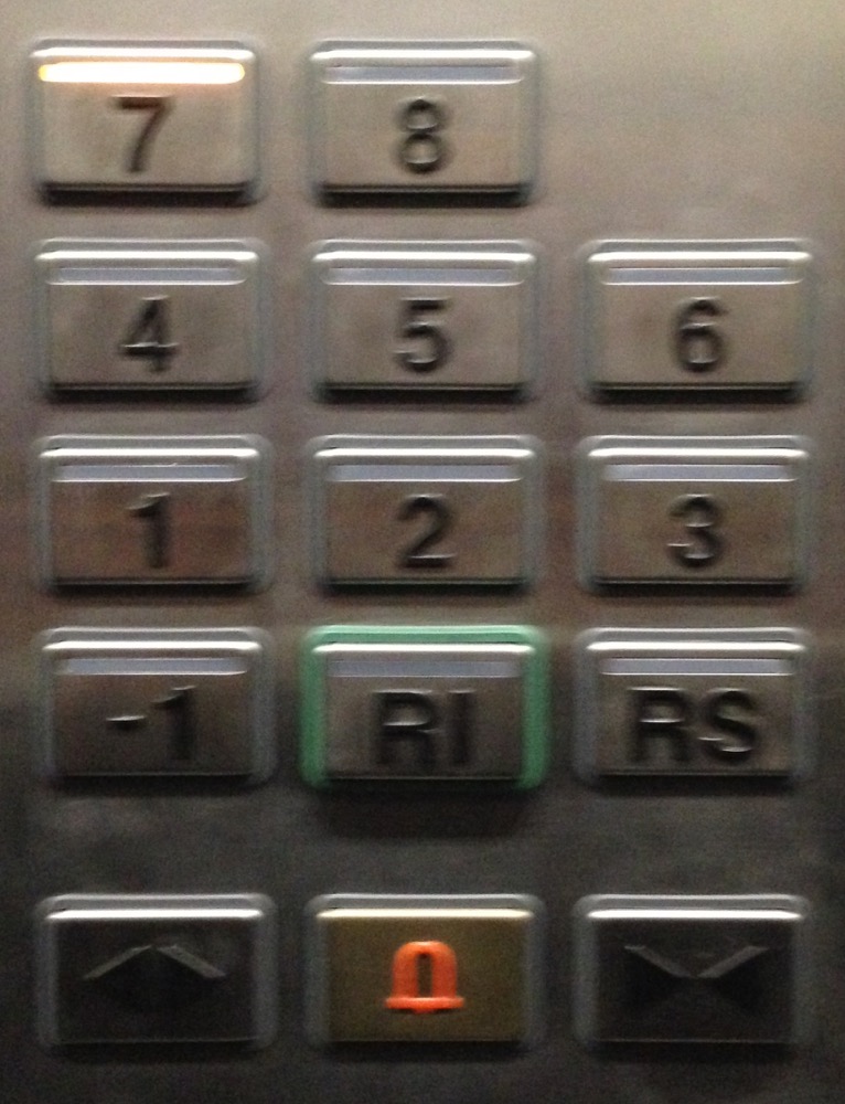
- 150: “RI” and “RS” for “Rez Inférieur” and “Rez Supérieur”
- 153: no 1st floor
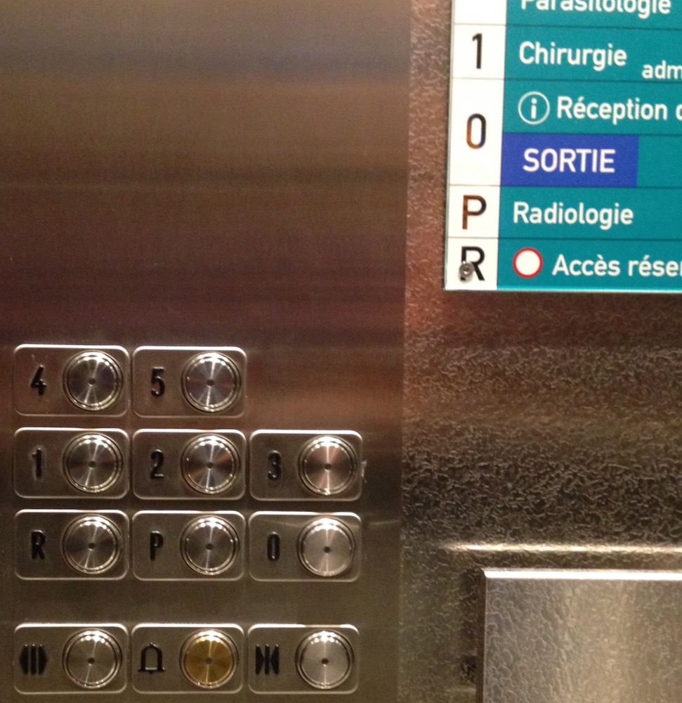
- 154: “P” is for “Radiologie” and “R” is for “Accès réservé”. Makes total sense!
- 155: like 065
- 162: like 065
- 163: you had 1 job!
- 165: like 148
- 166: like 065
- 168: the 0 is on the wrong side… argh!
- 171: this would not be a proper post about elevators if there wasn’t at least one mention of men’s genitals. Yes, somehow people love to draw dicks in elevators. Here however it’s the less graphical and more literal version (“MA BITE” = “my dick”)
- 174: that button-press-preventer is cute
That’s it. Thanks for reading :)
in a recent episode of the Hello Internet podcast, Brady Haran and CGP Grey mention this Chinese weirdness ↩︎