Archilogic update
For my previous software engineering jobs at ELCA/SecuTix, Doodle and Bestmile, I wrote a summary and first impressions after 100 days on the job. Last time I was late by 4 weeks, and this time I’m late by an additional 100 days or so. The procrastination is real. The nice thing though is that after almost 1 year, there are some tangible improvements in the Archilogic product offer.
I remember when I interviewed for the position, my soon-to-be team lead Ben asked me if I preferred working on new projects, or taking over existing ones, maintaining them and making them evolve. As you do during interviews, you try not to close to many doors, and I answered that it didn’t matter to me. Besides an on-boarding assignment where I tried to implement collision detection into movements in the Floor Plan Engine[1], and besides the first couple of weeks I spent implementing 2D drawing helpers with close to no help, I ended up being assigned to the Editor: a web-based floor plan visualization and editing app. In other words, maintenance and evolution of an existing project.
And there was (and still is) a looot of maintenance to be done, technical debt and legacy features to take care of. To some extent, it is unavoidable for software to end up in that state in a very small team, in a company with quite some turnover. But some issues are also caused by laziness or lack of discipline. For example, there were barely any unit tests. As of writing, the test coverage is at 40–50%, which despite my efforts, is still far from the 80-ish percent I would like to achieve.

Preparing the way
Ben kicked off the first major chore in late 2021: migrate from Vue 2 to Vue 3. It took a couple of weeks, during which I also introduced Tailwind CSS, replacing a whole bunch of layout components. I also got rid of a legacy flavor of button components. All of this was done to the existing Editor product.


The new Editor UI
Then we kicked off the complete revamp of the Editor UI. This endeavour would run in parallel to the existing product for the next 6 months. First, I had to get rid of the 3 different design systems the Editor was using, and introduce and exclusively use the new design system built by Iana. Anyone who has ever done this knows it’s no simple task. You have to revisit everything: typography (headings, text sizes and weights, etc.), spacing, layout, replace buttons, selects, menus, and so on. No stone left unturned.
Roman was working in parallel on an overhaul of the Dashboard, the app used to browse floors, administer users, API tokens, change user preferences, etc. This meant that the authentication flow for the Editor needed to be changed as well.
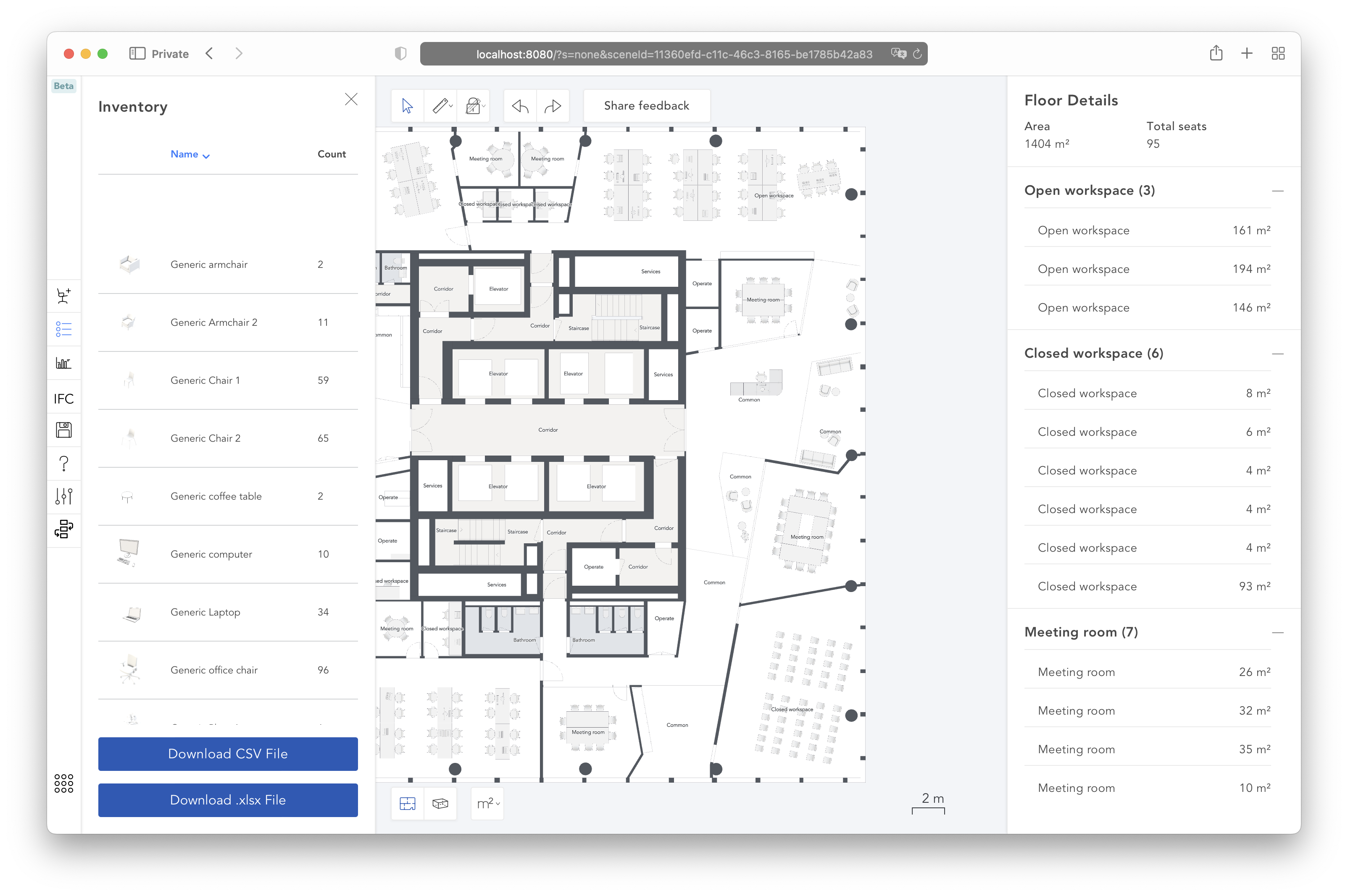
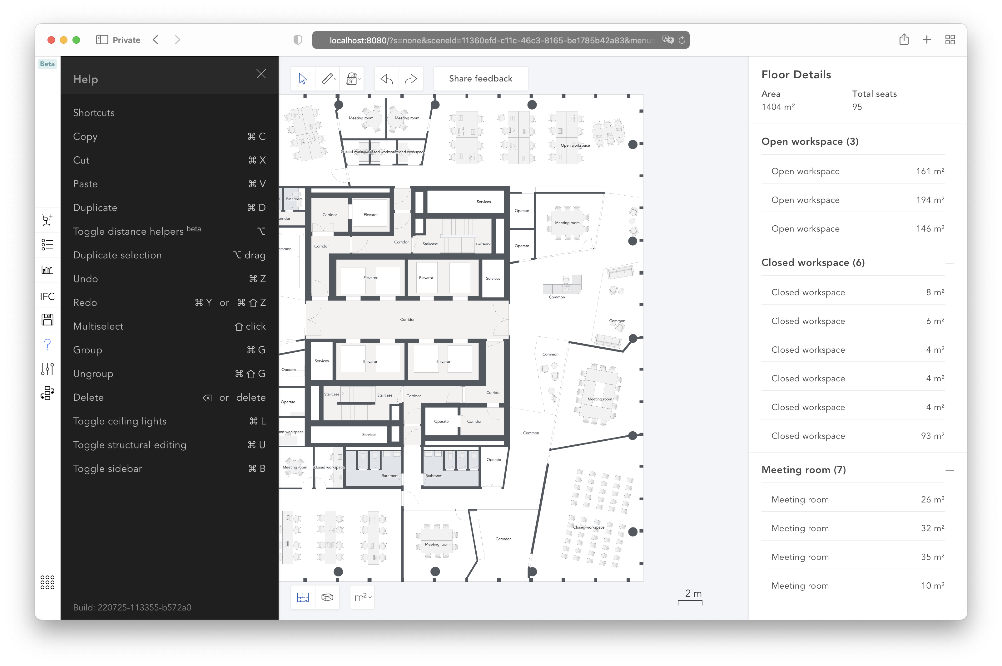
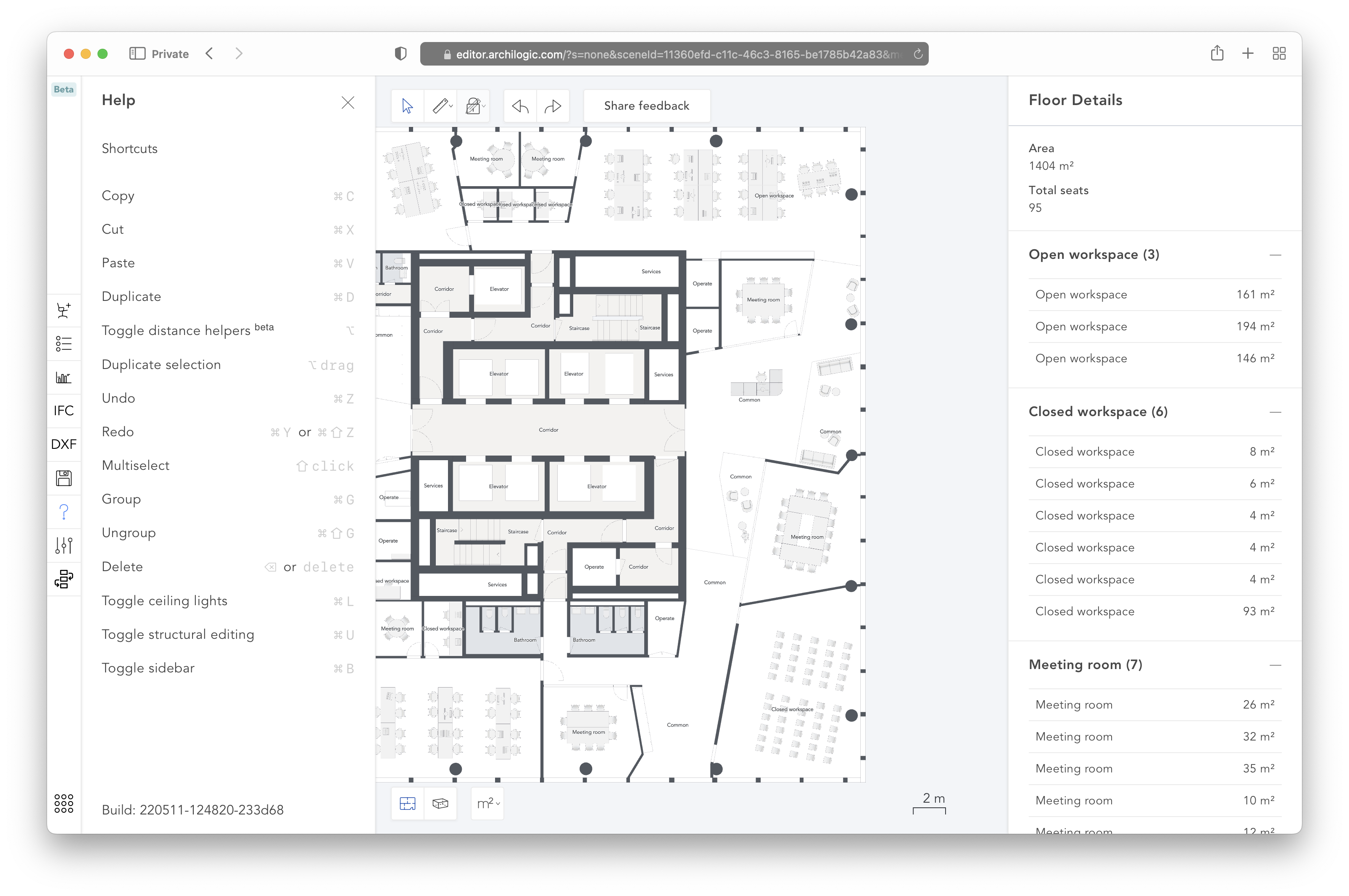
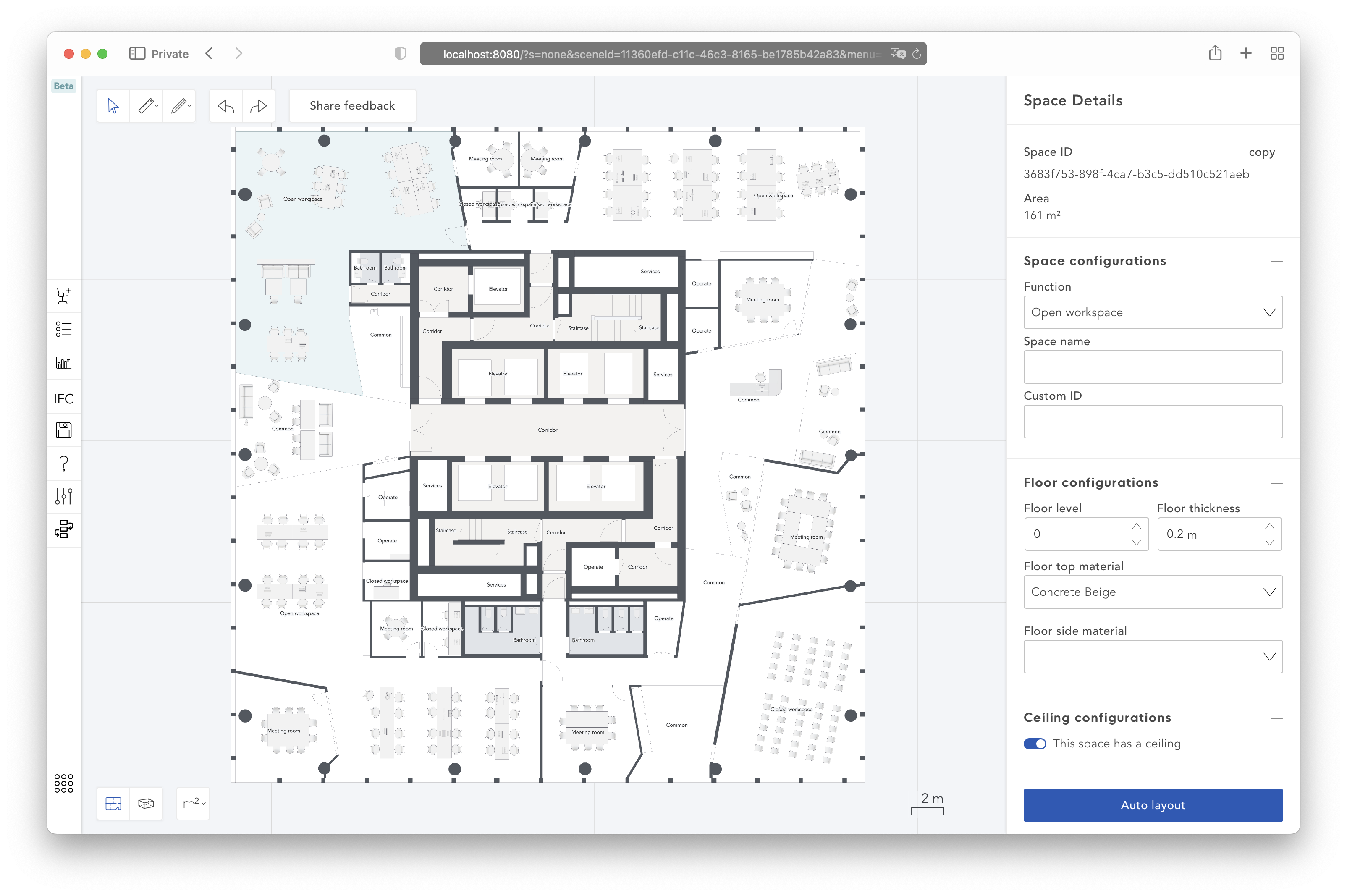
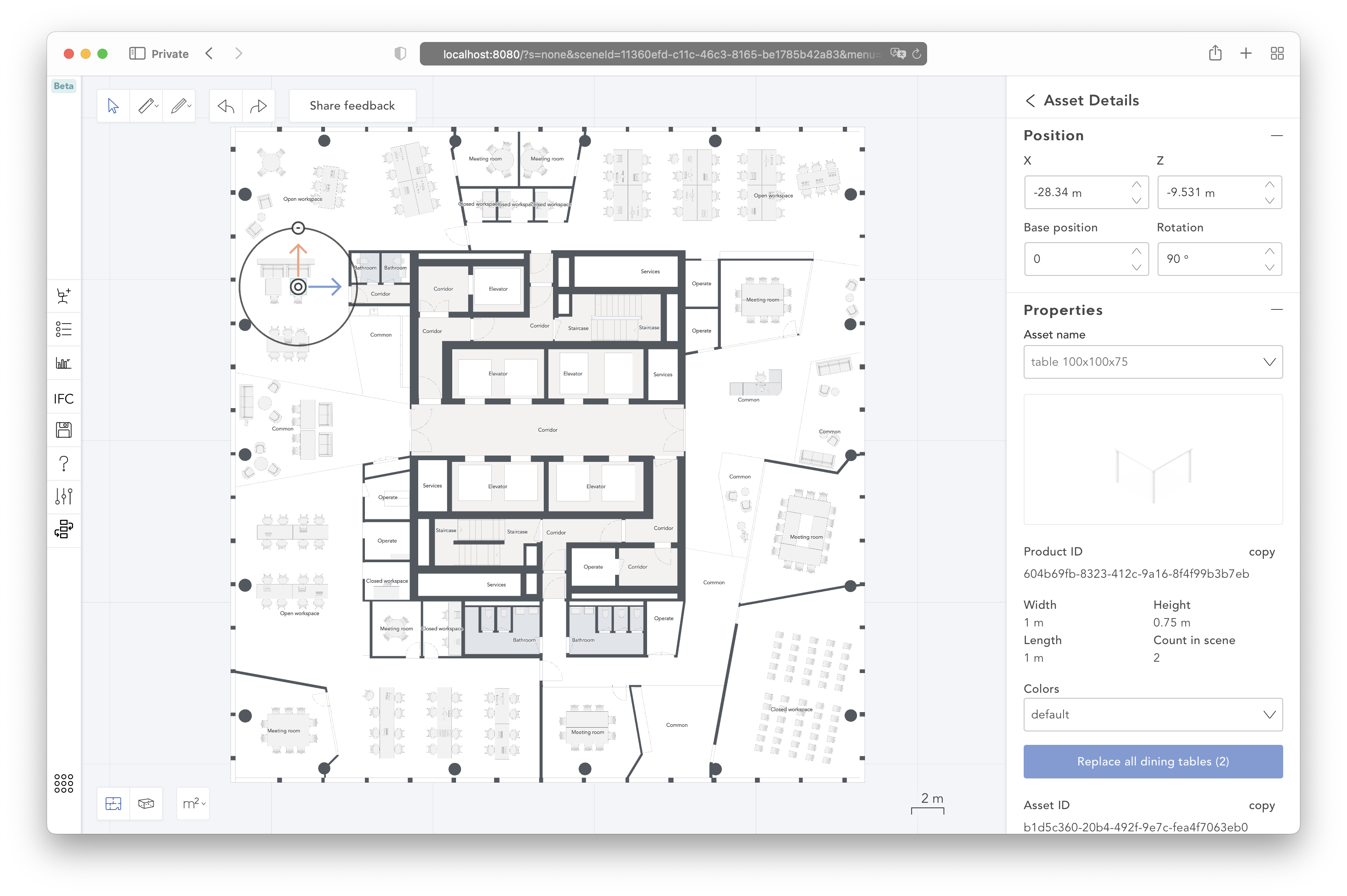
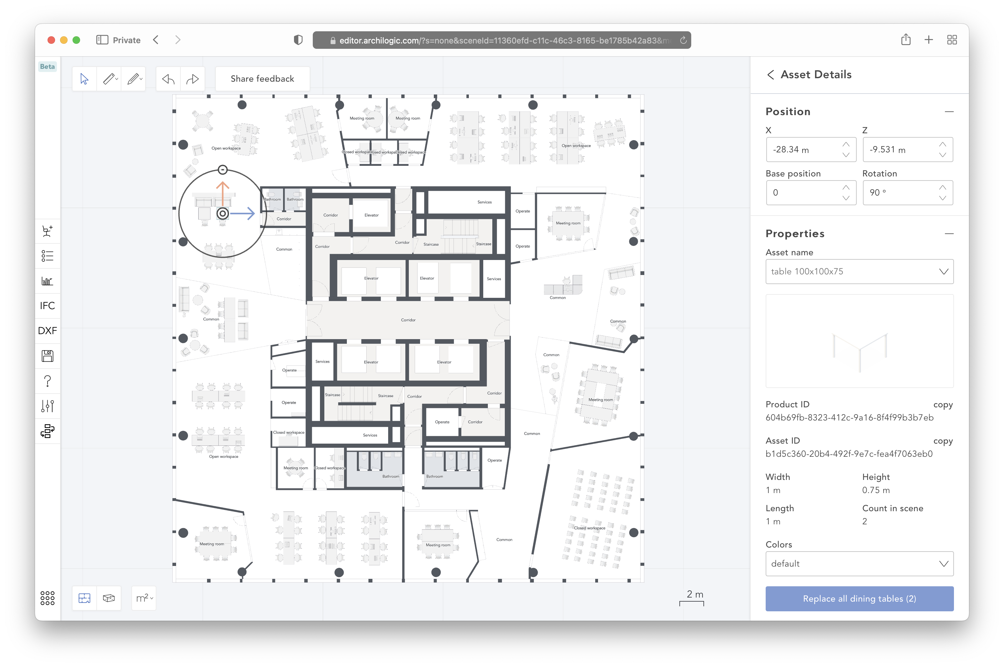
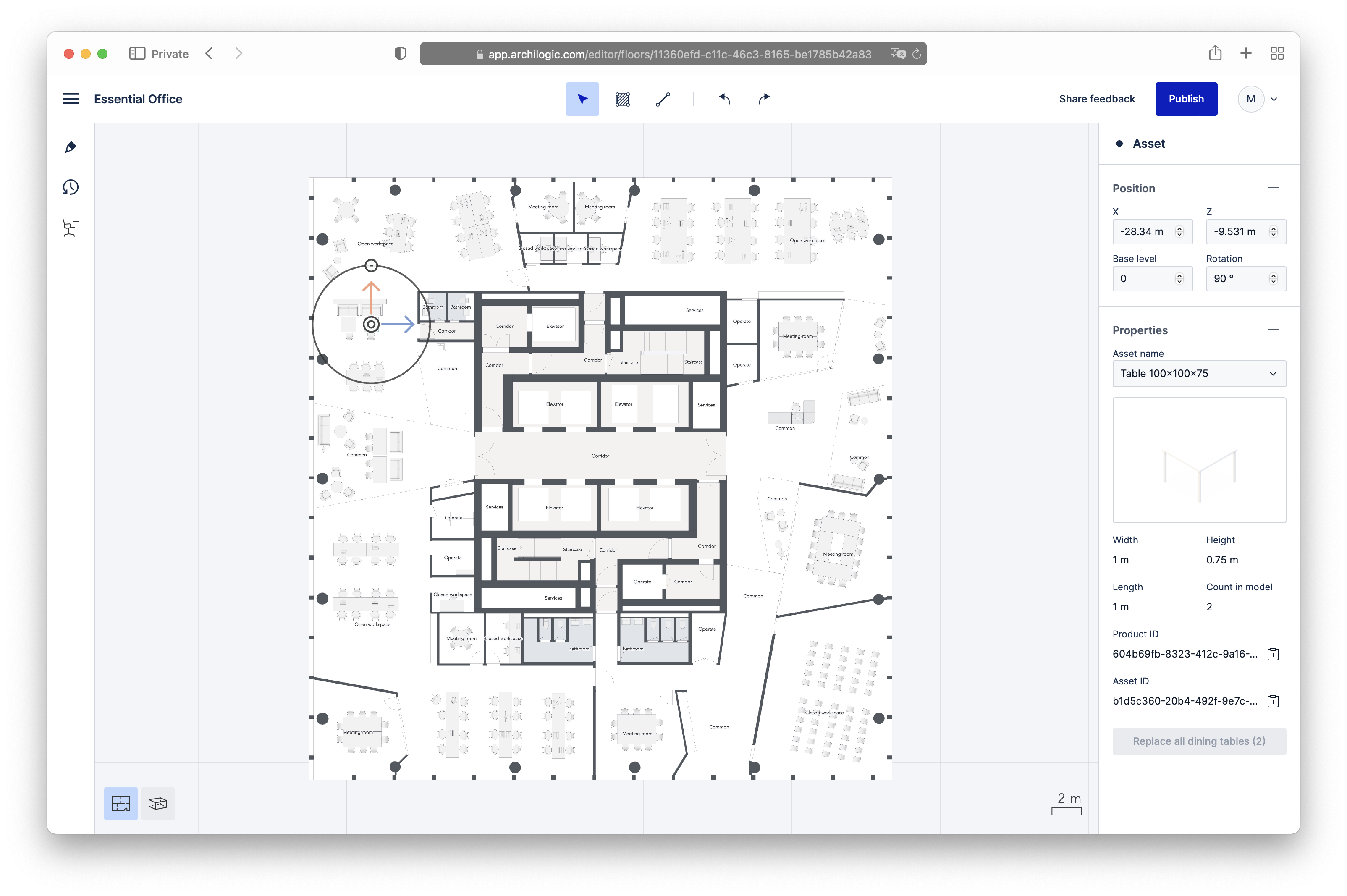
Once the new design system was successfully introduced, I could tackle new UI elements that did not exist in the previous version of the Editor. The most prominent one being the main menu[2]. There was already some legacy code duplication for some actions the user could trigger either via the left-click context menu or via other means, usually in the inspector panel. Now having the same actions available through a third mean—the main menu—signified that it might be a good idea to centralize the code that managed the user’s actions, when they could be executed (permissions, feature restrictions related to the client’s subscription plan, etc.) and what keyboard shortcuts triggered the actions.
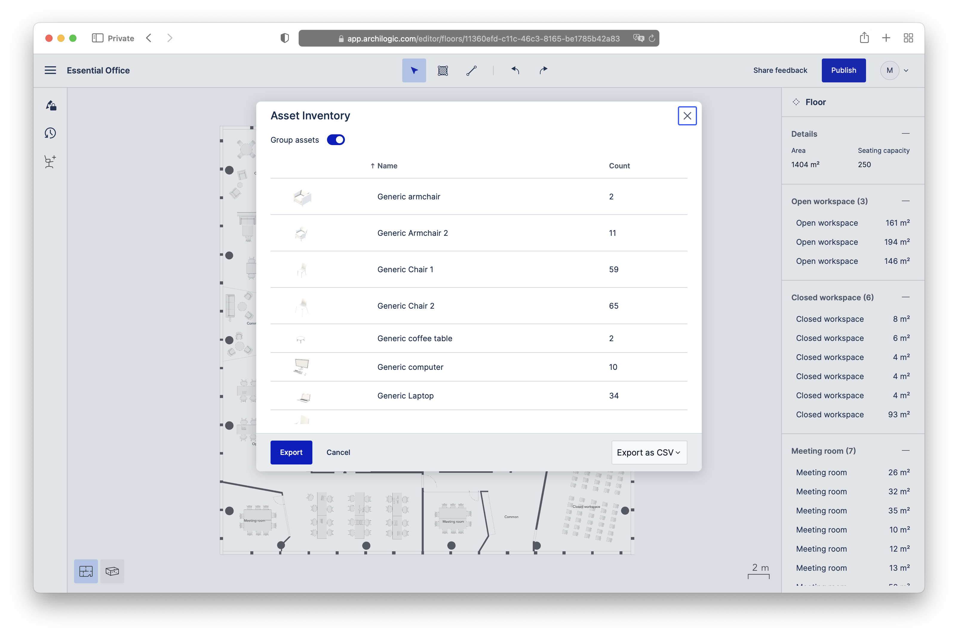
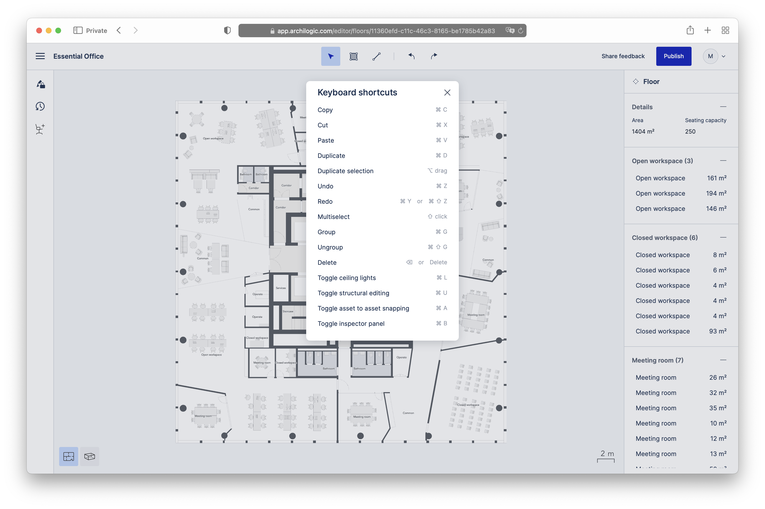
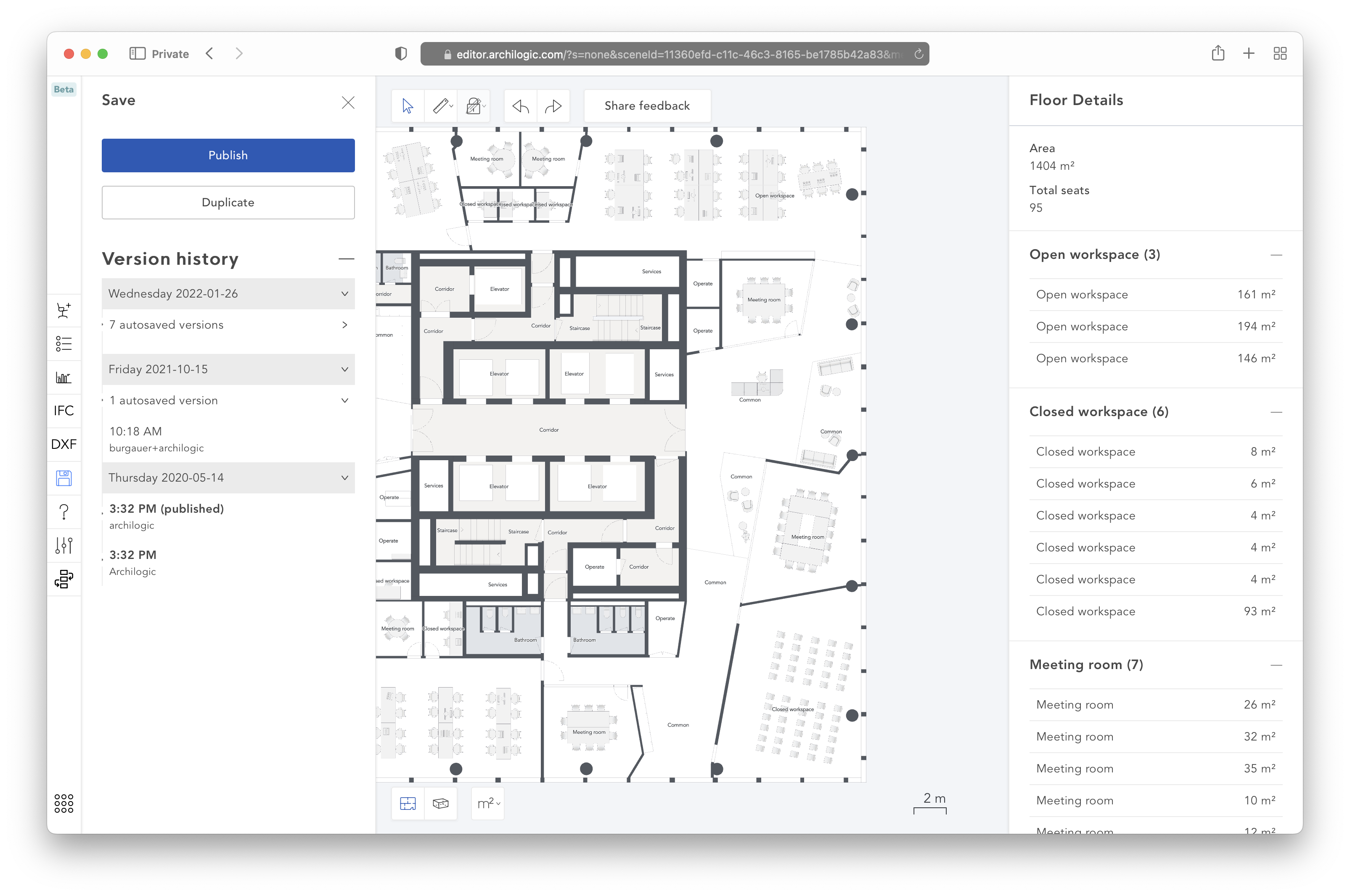
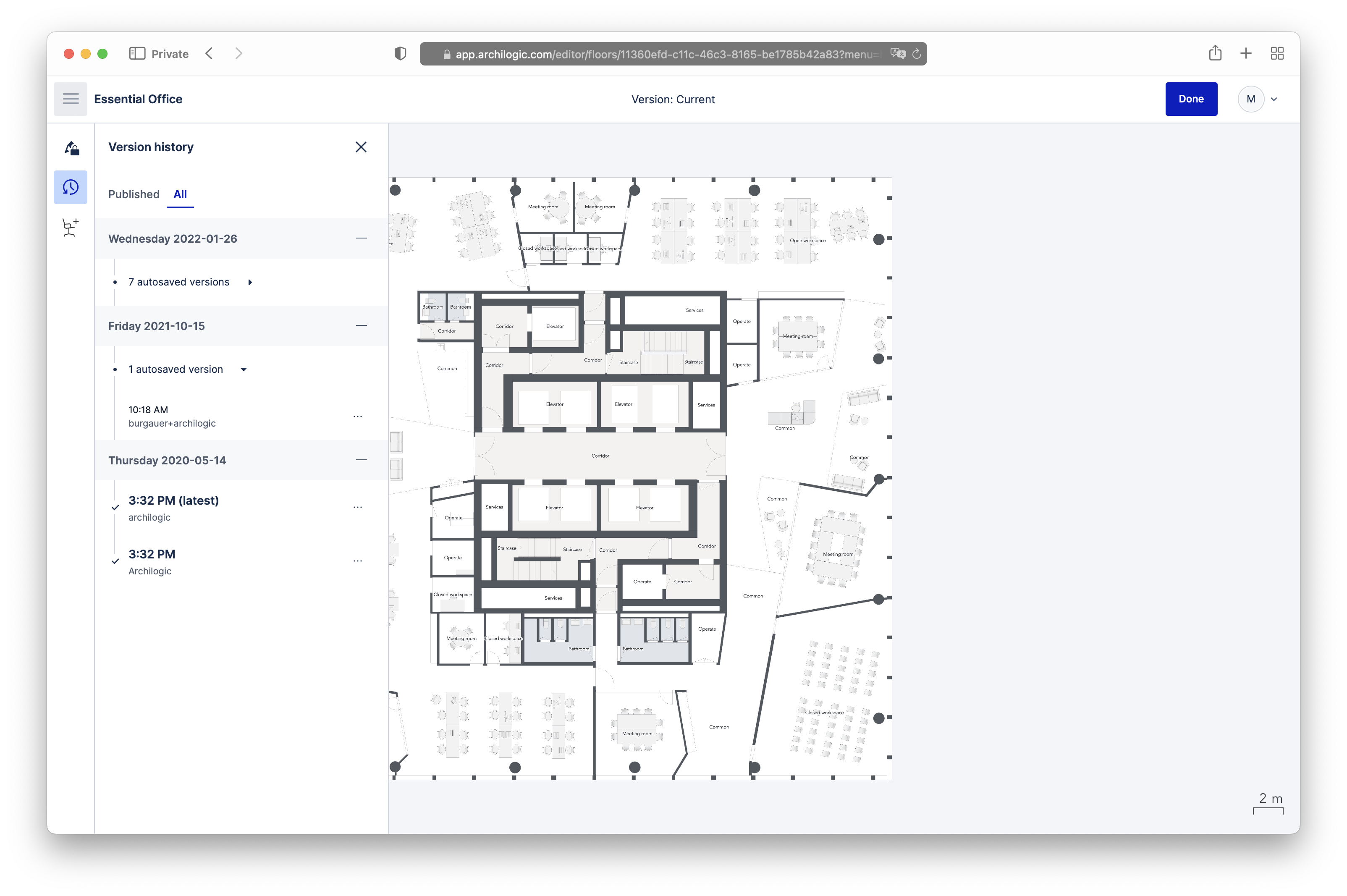
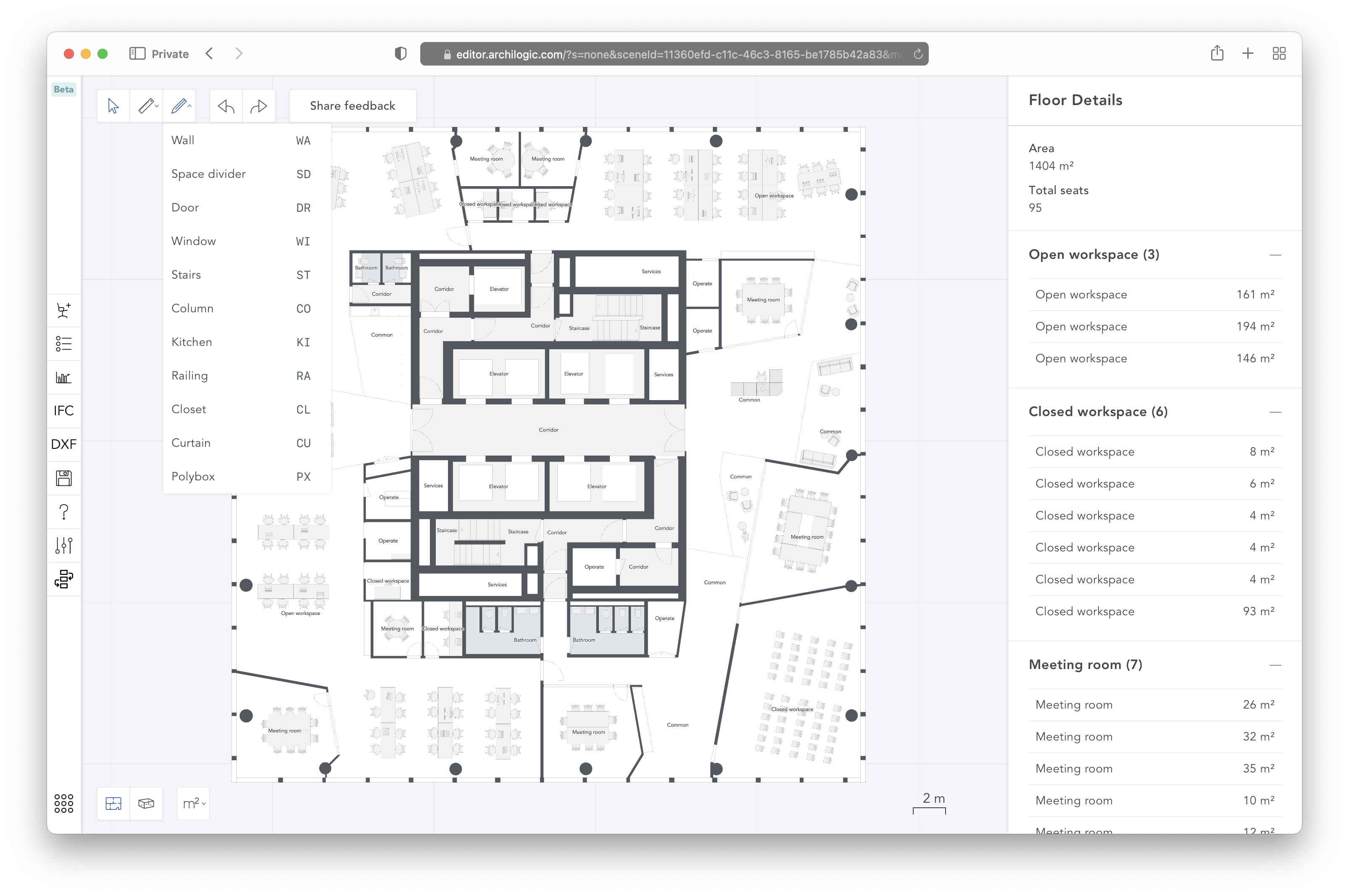
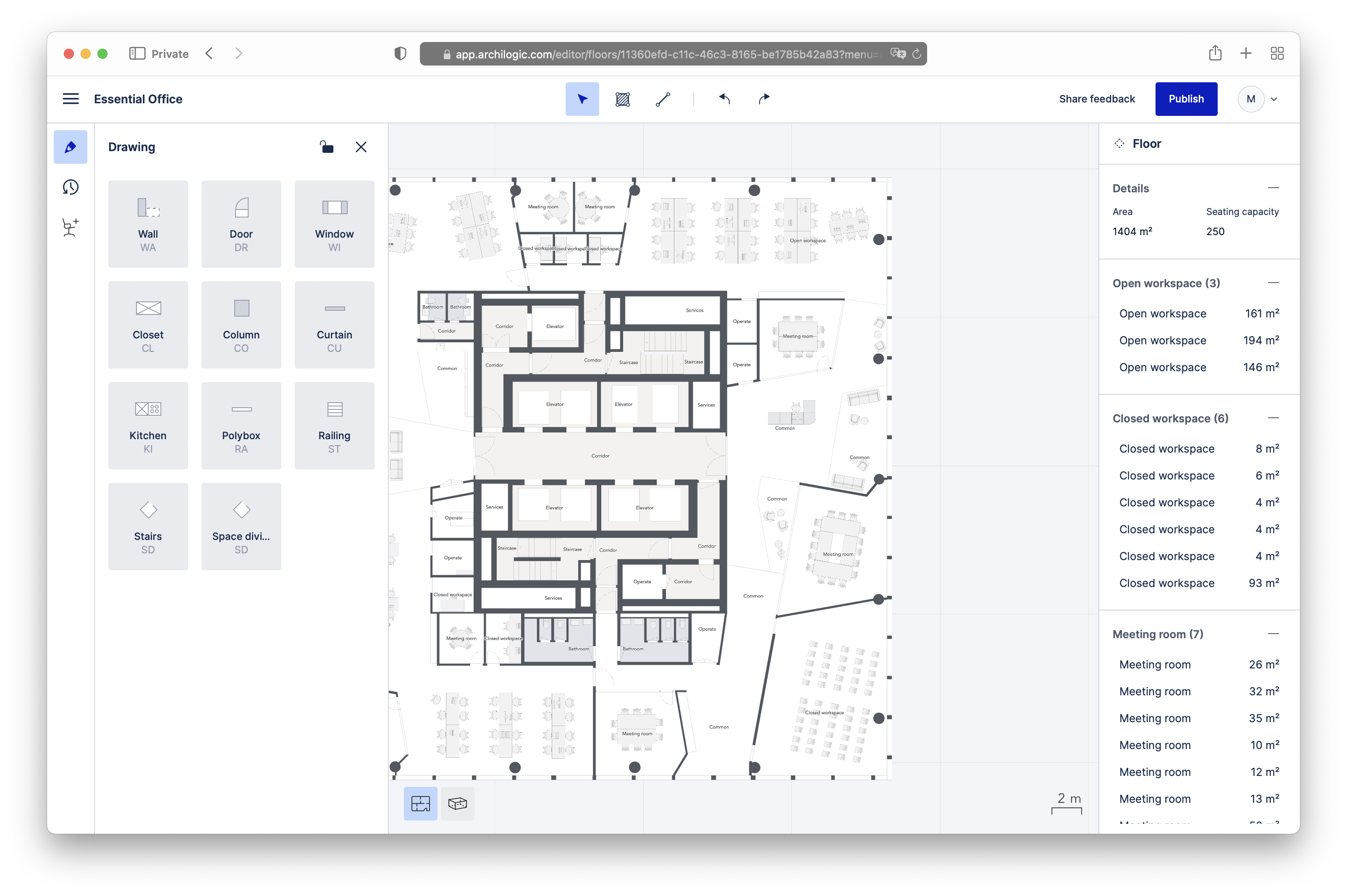
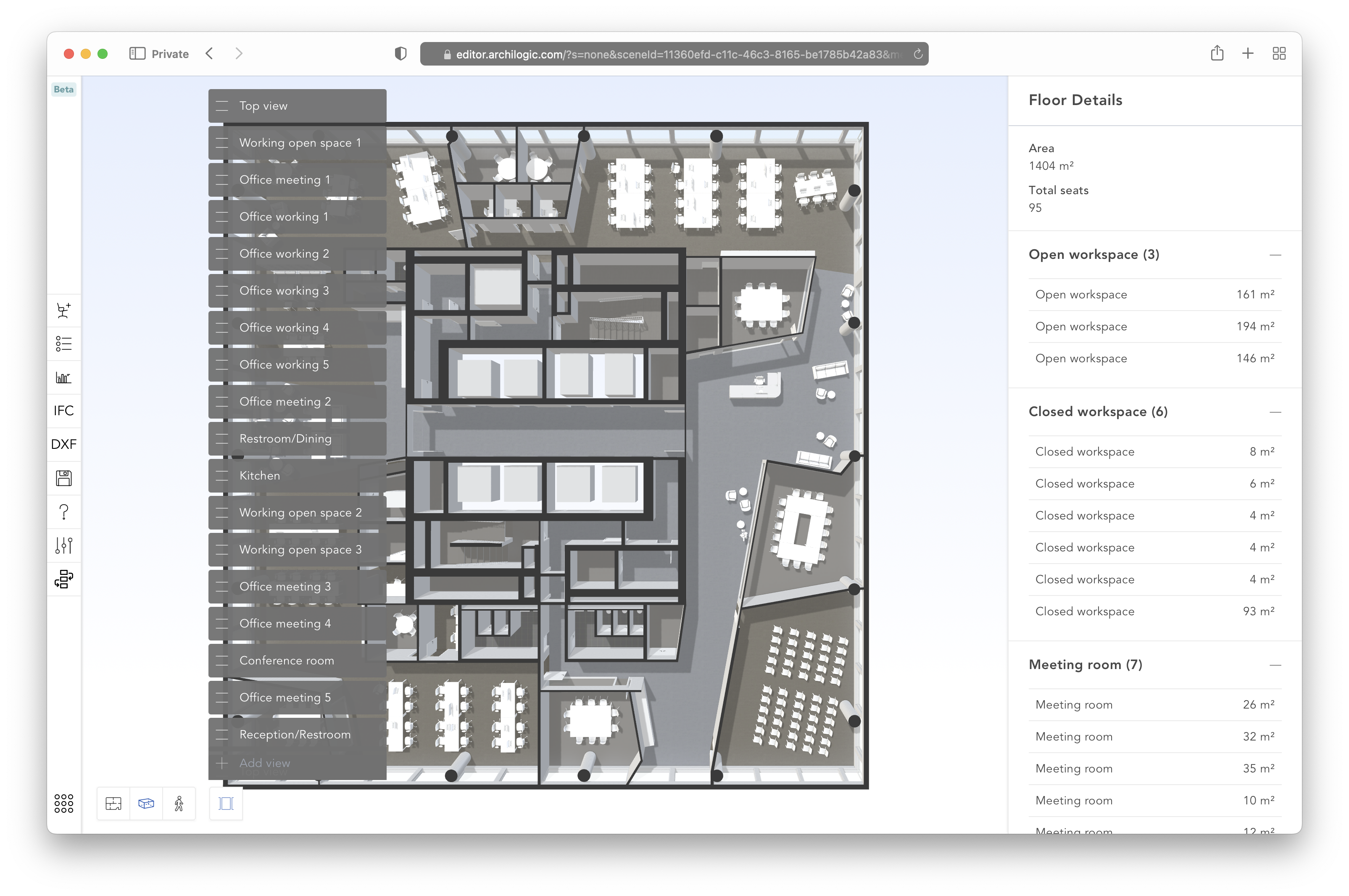
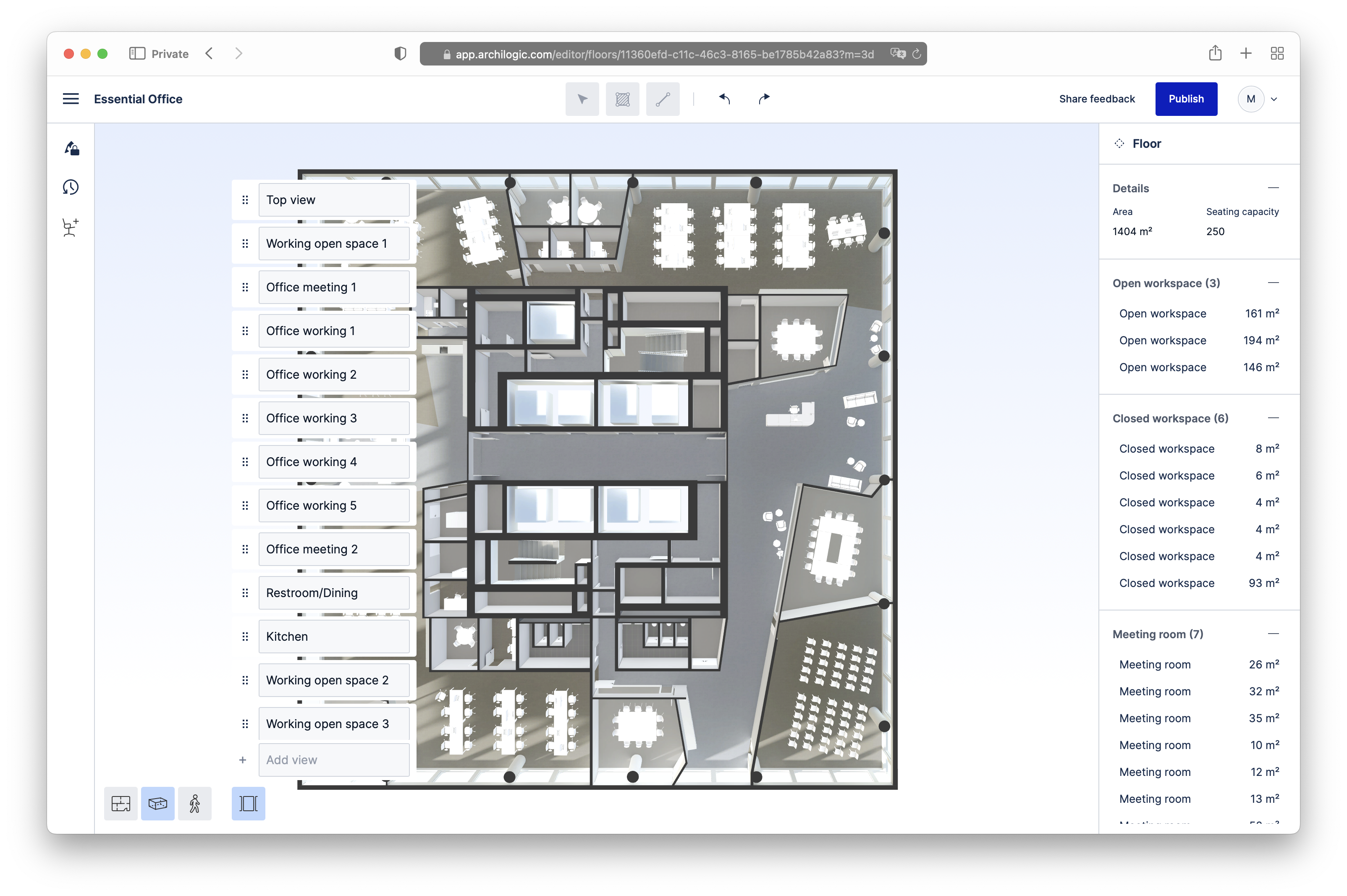
All of this amounted to 226 commits, 412 changed files, and about 15k line changes[3]. It got silently[4] released to the Archilogic users early August 2022. The following screenshots illustrate some of the visual changes. First, the same 4 screens as above:
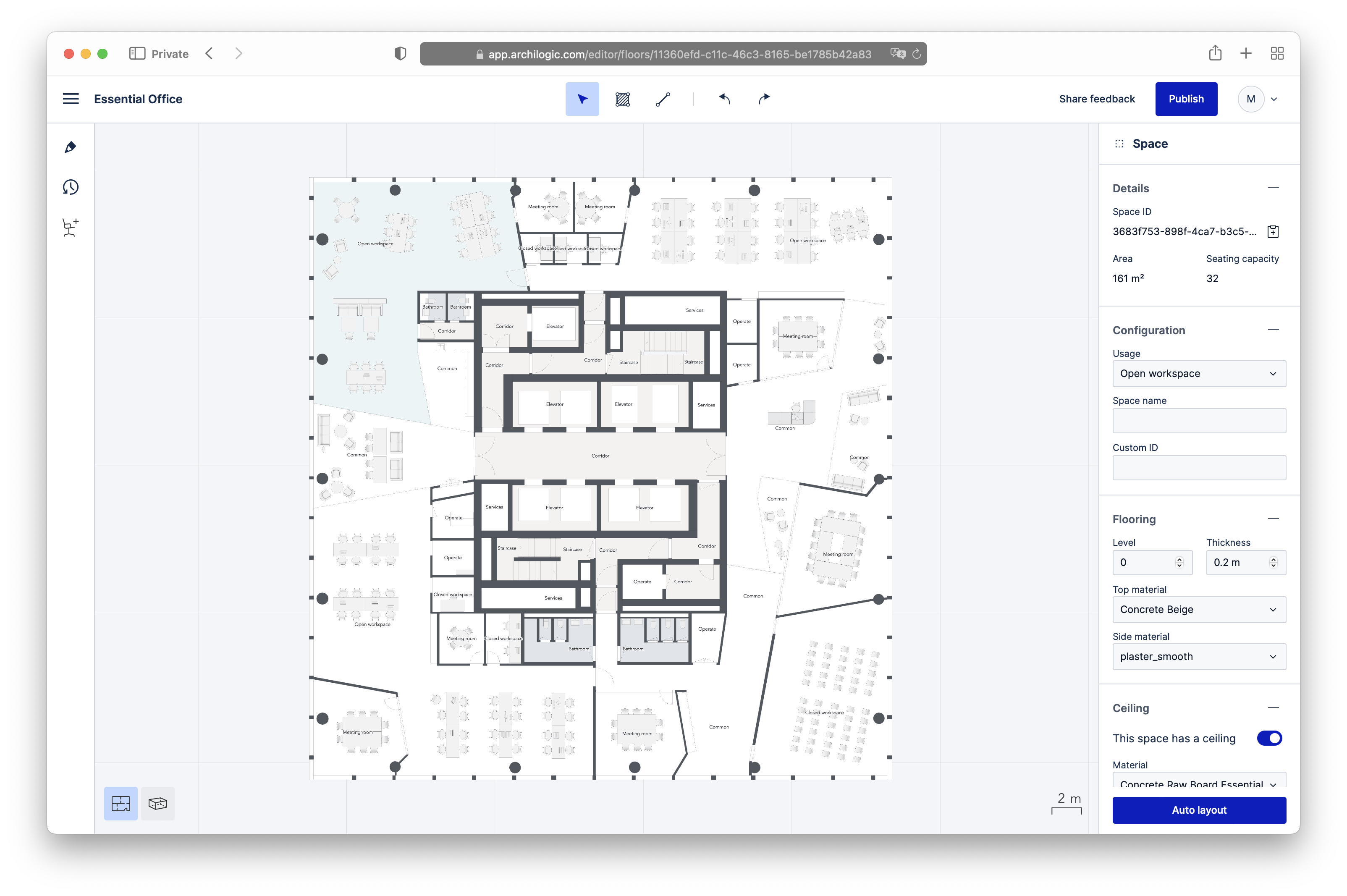
Here’s the full contents of the new main menu. Some entries are hidden or disabled based on the user’s role and permissions, as well as on the features available per subscription tier. Some entries are disabled if the given action is not currently available, e.g. when nothing is selected on the floor plan and the action requires a selection.

Finally, some other notable UI changes:
In parallel to all the UI changes, I implemented some new features as well, like asset to asset snapping, that allows to perfectly align the bounding boxes of the furniture. And there were many many improvements under the hood.
Learning
Changing jobs and diving into a totally different codebase usually means that there is an opportunity to learn new stuff:
- Vue. At Bestmile, we were using React. For me, there is no clear winner. A framework is a framework…
- Vite for building the apps (you know, the part that shouldn’t exist in frontend dev)
- TypeScript. I used to love the freedom provided by the lack of typing. Now I think using a typed language is safer. But any type system grafted onto a non-typed language is not the solution, because the syntax often is crap, and there always are escape hatches. I hope one day there will be widespread usage of a true typed language for frontend dev
- I needed to refresh a bit my trigonometry and linear algebra
- Editor is the first app I work on that relies heavily on keyboard and mouse interactions
The team
Archilogic is a remote-first company. Also, I joined in the fall of 2021, when many Covid-19 restrictions were still in place. I was however lucky that during my first days there was a week-long company get-together. I got to meet everyone in person which was nice. Everybody is friendly, ready to help. As far as I can tell, there is no political bullshit. In the small frontend dev team, we have complementary personalities and knowledge levels: Roman is very fast but a bit messy, Iana is very detail-oriented but knows when to stop going down rabbit holes, and Ben brings a lot of experience in the domain and the used technologies.
The one thing that has been bothering me for months is that we have more or less no product management. Tasks are usually poorly specified, sometimes not at all, or just with a title in pseudo-English. There is almost no process. Tasks are not groomed, tasks prioritization is more or less left to the developers. Our 2-weeks cycles systematically contain double the amount of work that can be accomplished. There are no retrospectives, except quarterly ones (sometimes), which to me signifies that nobody wants to learn from mistakes. I have always found daily standups to be the most useless scrum ritual, because you could just look at the board to know what people are working on (as long as they update the status accurately, of course). Yet somehow it is the only ritual that we do at Archilogic. Being remote-first, it is nice though, as for me it often is the only face-to-face human interaction I have in the day.
in the process uncovering bugs that are still to be fixed ↩︎
I’m still sad it’s a 2-level hamburger menu, not a 1-level menu bar ↩︎
including changes in package-lock.json, so that number is a bit overblown ↩︎
at the time of writing this article, the last post on the Archilogic blog is indeed titled “Introducing The New Archilogic Editor”, but it is dated November 2, 2021 and is about a previous version ↩︎