Blogger narcissism
From now on, Google Analytics tracking has been removed from this website. There are a couple of reasons, but the main one is that I don’t really care. The data collected since January 1st 2014 – so 2 years – also tell me that I should not care. Most is either useless, obvious or annoying.
Data I can’t explain
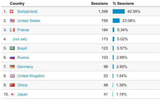
Who are these people from Brazil, Russia, the UK, Japan? Brazil might be explained by new Doodle users, as my website is linked to from the team page.
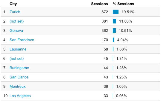
The same goes for the cities. Do you know where Burlingame and San Carlos are? It turns out they’re in the SF Bay Area, next to SFO San Francisco International Airport. So that’s most likely Alex :) I can’t really explain Los Angeles though.
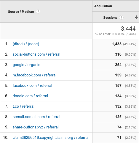
The direct referrals surprise me a bit, because most people who know about my website can’t remember its address. Referrals from Facebook and Twitter are expected because that’s where I post links to newly published articles. The referral number from Doodle is slightly surprising because I didn’t expect people to actually click on the link on the team page.
Data that disappoints me

There is a constant random number of visitors to my website. My guess is that there are peaks whenever I link to a new post on Facebook and Twitter. Here are the highest of those peaks:
| Date | Number of sessions |
|---|---|
| April 3 2015 | 100 |
| March 29 2015 | 62 |
| January 6 2016 [1] | 53 |
| March 23 2015 | 48 |
| March 1 2015 | 41 |
| March 20 2015 | 38 |
| March 22 2015 | 38 |
| June 14 2015 | 36 |
| April 15 2014 | 34 |
| March 13 2014 | 32 |
| October 24 2015 | 32 |
| January 7 2016 [1:1] | 32 |
Based on this hypothesis, if for each of the dates above I look at the article that was posted closest to it in the past, I could in theory make a list of your favorite articles:
- God Is Disappointed In You (March 22 2015)
- Ups and downs (October 24 2015)
- Bike messenger (March 1 2015)
- Rock 666 alleycat (June 8 2015)
- Tinder no gos (April 15 2014)
- Ma première alleycat (March 13 2014)
Probably the peaks alone are not enough to determine your favorite articles, because all the rest of the visits add up as well. According to Google Analytics, here’s the top 10:
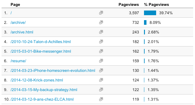
The fact that the homepage is the topmost page doesn’t help to determine the favorite article, as almost every article was the homepage at some point[2].
Why is this data disappointing? Because the articles I spent most time writing or that I find most interesting are not the most read it seems.
Mixed feelings
I’m actually not sure that I interpret the following breakdown correctly:

Basically any visitor that spent under 180 seconds did not read anything. Most of the sessions fall into this group. However a majority of pageviews fall into the 180+ seconds group. I would say this means that most people are not interested in anything I write, which is understandable and doesn’t bother me at all. There is however a small group of people – I would like to think that it’s my friends and family – that actually do read my articles. Or those that open the page, leave the browser tab open, go get coffee and never come back (1801+ seconds is more than half an hour).
Data I like
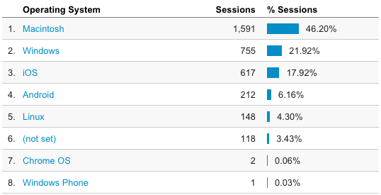
Mac wins over Windows, iOS wins over Android, and the Chrome/Safari/Firefox trio ridicules Internet Explorer.
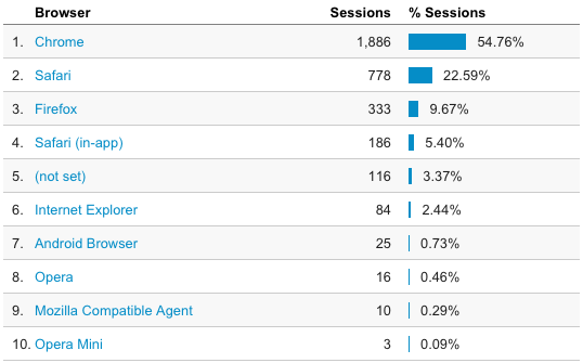
Who the hell are those Opera Mini users?