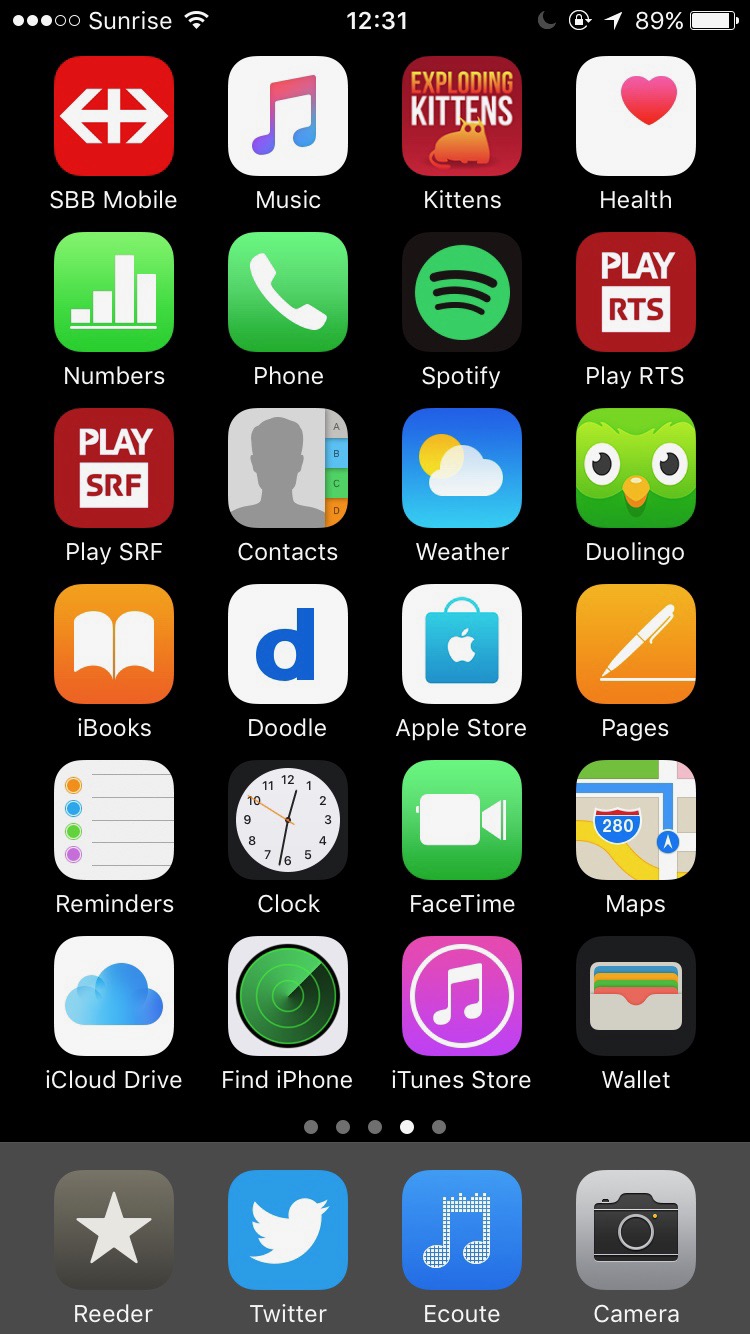
iPhone homescreen evolution 2
This is a follow-up to my initial iPhone homescreen evolution post from 7.5 years ago. I won’t go as much into details and link to all the apps in the app store this time.
My current homescreen

Thanks to App Library introduced in iOS 14 I have a single homescreen. I even have only 1 folder, grouping apps used for biking. From top left to bottom right:
- a widget stack with 1) MeteoSwiss, the Swiss weather app, and 2) the default Apple Weather app. I often tap it to open the MeteoSwiss app and check the forecast for the next hours and the rain radar animation, to see if I can go mountain biking
- another widget stack with 1) the default Apple Calendar app, and 2) a custom Shortcut that reminds me of my pathetic sex life
- Settings, the iOS settings
- a folder of biking apps with 1) Ride which allows to link my phone to my helmet and automagically call an emergency contact if a fall is detected (no idea if it works, don’t wanna find out), 2) Strava which tracks my bike rides, 3) a bookmark to the Swiss maps which is actually mostly redundant with 4) Swisstopo the very good official Swiss maps, 5) Trailforks to find new trails wherever I am, and 6) Rega the Swiss helicopter rescuing service
- SBB Mobile, the app for Swiss public transportation schedules and tickets
- Couleur 3, the radio I listen to daily
- Photos, the iOS picture management app
- Mail, the iOS emailing app
- 1Password, a password management app. I’m wondering if the password management built into iOS could fit my needs…
- Music, the super shitty iOS music app
- App Store. I’m not sure this really deserves a spot on the homescreen!
- Safari, the iOS web browser
- Notes, the iOS note-taking app I use a lot mainly thanks to its syncing to my iPad and Mac
- Overcast, a podcast app. Its smart speed feature is very nice, but I could probably live with the default iOS podcast-listening app
- Slack, the chat app for my job. All notifications have been disabled! I also have no access to work emails on my phone.
- Camera, the iOS picture-taking app
- Duolingo, to learn Arabic
- Tinder, the soul-crushing dating app
- a super ugly useless space! Apple, what the fuck are you doing?!
- Twitter, the social network I should quit
- Reeder, my long time RSS reader. Use RSS, folks!
- Messages, the iOS messaging and SMS app
- Signal, my WhatsApp replacement
I have notifications turned off on most apps. All group chats are muted.
2014–2021

That’s where it ended last time.
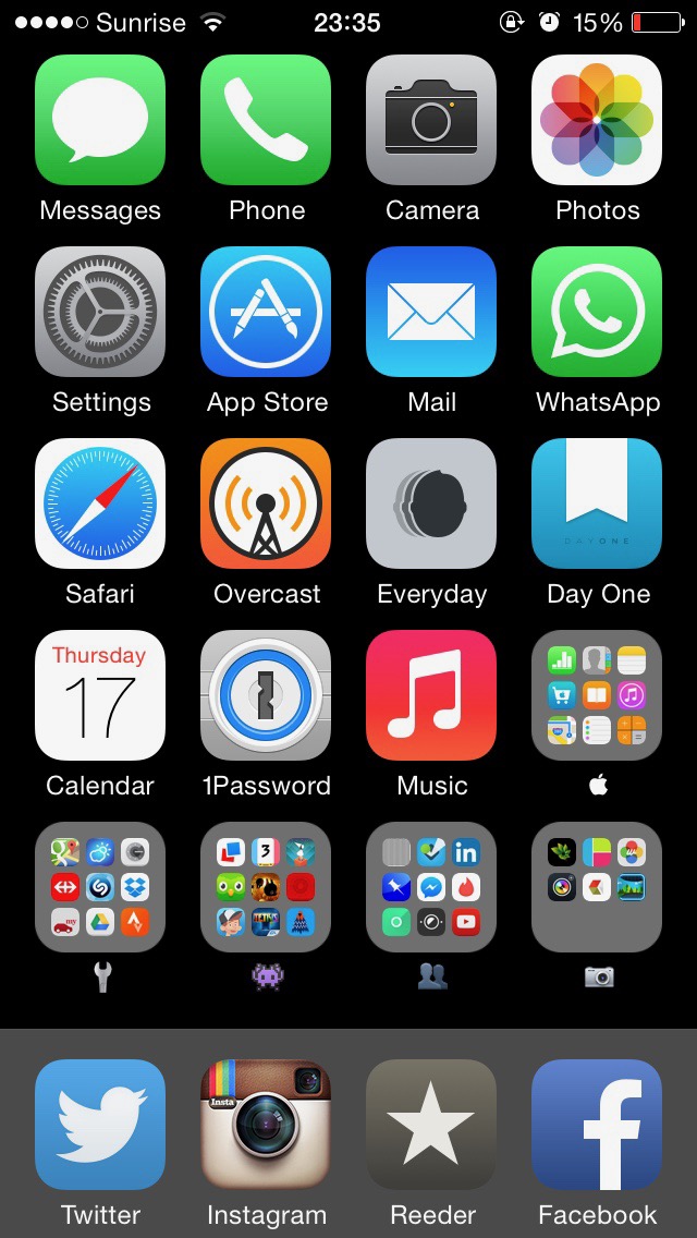

I kept the idea of having a single homescreen, with the least used apps tucked away in themed folders. Overcast must have come out around that time, as I replaced the Podcasts app with it. Tinder made a comeback. Also, the spacing between the app icons and names apparently increased ever so slightly.

Tinder got replaced by the Pumped 2 game. Again, there was a slight shift of spacing between the app icons and names…


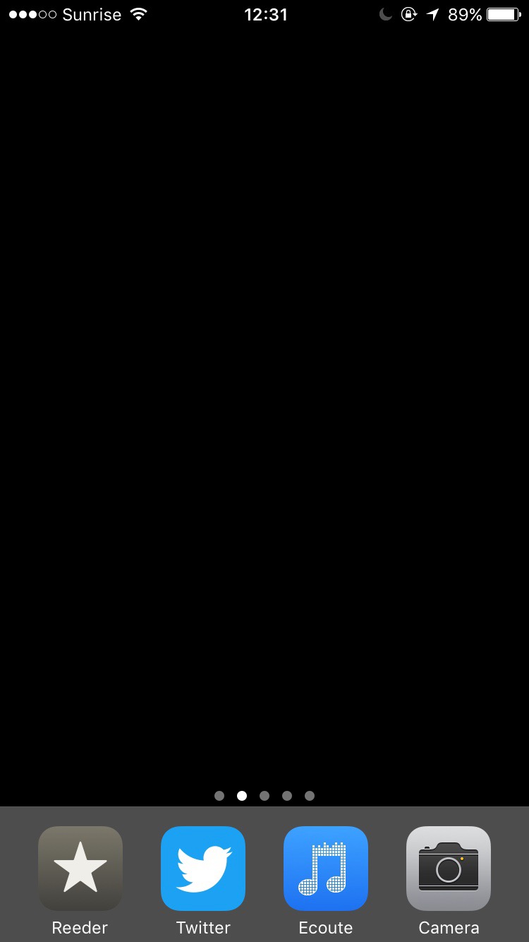
Still having a single homescreen, but with just 1 folder and 1 app. It seems I kept it like that for about 1 year, surprisingly.

Here, the idea was an empty first homescreen, and having all other apps ordered by most to least used on subsequent homescreens. No folders. For a while I was using the Ecoute app instead of the default Music app, but then both started sucking equally.


That’s an evolution of the previous concept, still with the ordered apps starting on the second homescreen. But there are no additional homescreens and all the remaining apps are squeezed into 1 folder.

I briefly tried having an additional folder dedicated to games only.

I got rid of Google apps and all Facebook apps except WhatsApp. I also experimented with having fewer apps in the dock.

I started taking into account the one-handed phone holding reachability by moving the most used apps to the bottom right area instead of the top left. The most notable app change is replacing the broken Everyday with Dayli. And again, another difference in spacing between the app icons and names. The designers at Apple sure have no higher priorities.


Whaddya know? The spacing between the app icons and names is back to what it was in early 2019.


My first experiments with the newly introduced App Library and widget stacks. I tried having a full-width weather widget to see the multi-day forecast. In the end, it was eating up too much space, and not that accurate anyway.


I’m finally free of all Google and Facebook apps, including WhatsApp. I still have massive FOMO, partially justified, because I know I’m missing out on many things organized in WhatsApp groups and upcoming events published on Instagram. But I stand by my opinion that the Facebook company should not exist and that Google’s business is fundamentally invasive.

I use a black wallpaper on my homescreens because that’s what works best with all app icons. On the phone’s lock screen I do have a picture wallpaper though.